Environment: Macbook pro 2016
TrekAmerica offers exciting adventures in the United States, Canada, Alaska and Central America. Overall, it is a clean and simple in design site. But in order to bring beauty to the site it is necessary to correct common errors. We suggest to consider some of them.
#1. Irregular circles with numbers in the Our Top 40 Tour Experiences block
UI Bug
In this block, the round elements for some reason gradually cease to be round. If the number 1 is in a circle, then the numbers 2-4 are in the “flattened” circle.
Current look
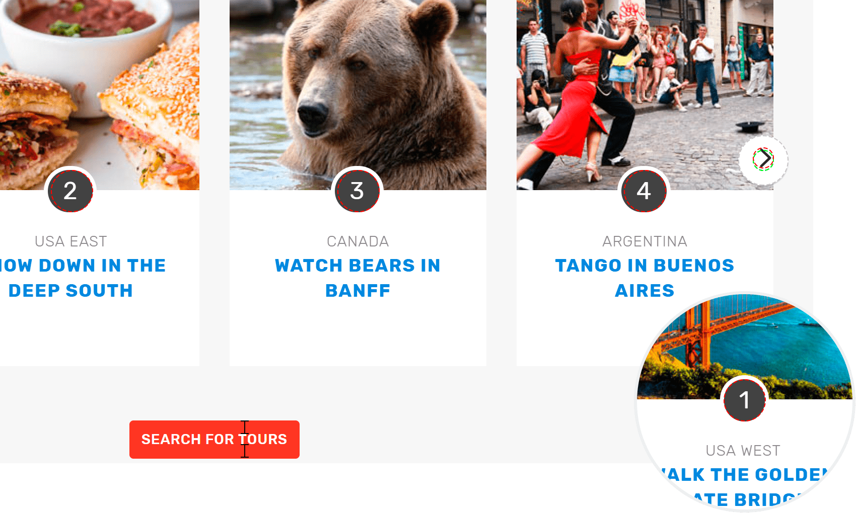
Severitymajor
#2. Phone icon in the Our Global Sales Offices block does not match the style of the site icons.
UI Bug
On the site, most of the icons are made in contour (linear) style.
In this case, the “Phone” icon is made with a fill technique, not a contour one. And the color in which it is made nowhere else is used on the site.
But this element is already in the right style in the Contact menu.
Current look
![]()
ProoflinkSeverityminor
#3. Different style of icons in the block Tour Extras
UI Bug
A single style of icons implies the same complexity and style of the elements. In the given case, the icons are drawn with different line thickness. The level of detail of objects is different, as well.
Current look
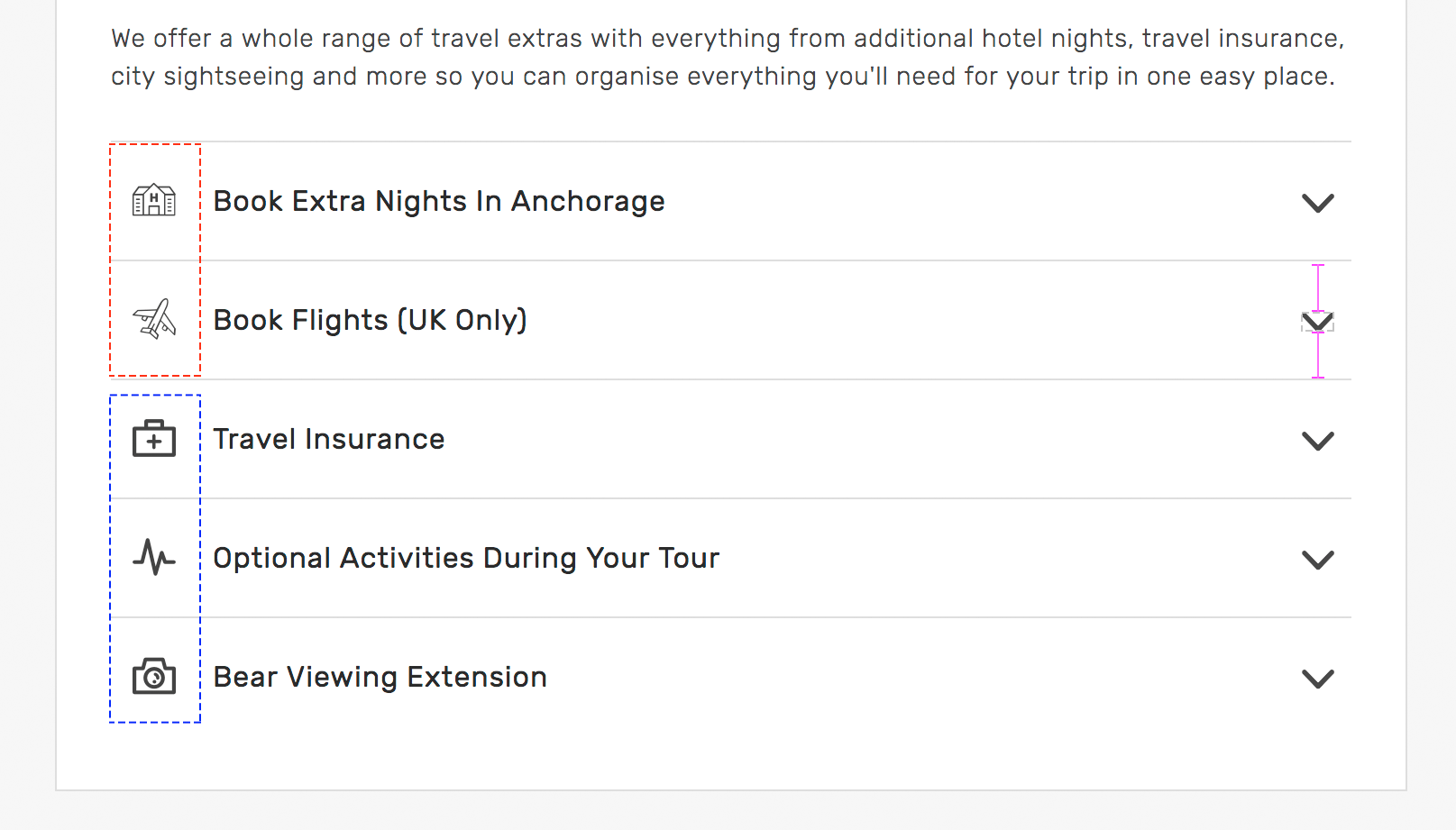
Severityminor
#4. Different style of icons in the block Travelling Together
UI Bug
In this case, the icons are linear but the level of detail, the number of elements differ, in particular, this is evident in the ALL INCLUDED icon.
Current look

ProoflinkSeverityminor
http://iconutopia.com/6-steps-to-make-your-icon-set-cohesive
#5. The center of the Contact block does not match the actual center.
UI Bug
Current look
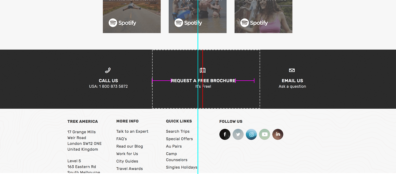
ProoflinkSeveritycritical
https://bbagraphicdesign2.jimdofree.com/unit-3-1/
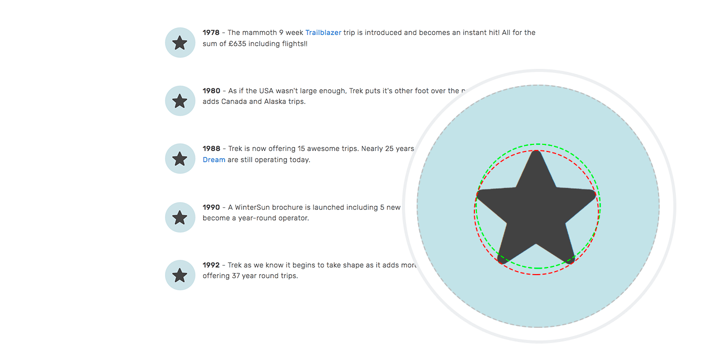
#6. The star icon is improperly aligned relative to the circle in the Our 45 Year Milestones block
UI Bug
A fairly common mistake is it when complex graphic elements are incorrectly aligned relative to the circle.
Current look
ProoflinkSeveritymajor
https://medium.com/@erqiudao/the-play-button-is-not-optical-alignment-4cea11bda175
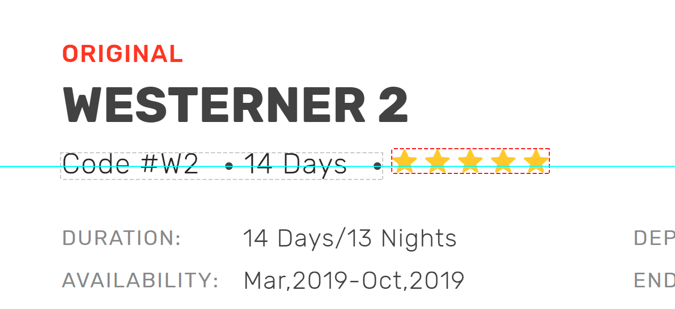
#7. Improper alignment of the list and rating in Tour Info block
UI Bug
Current look
Severitymajor
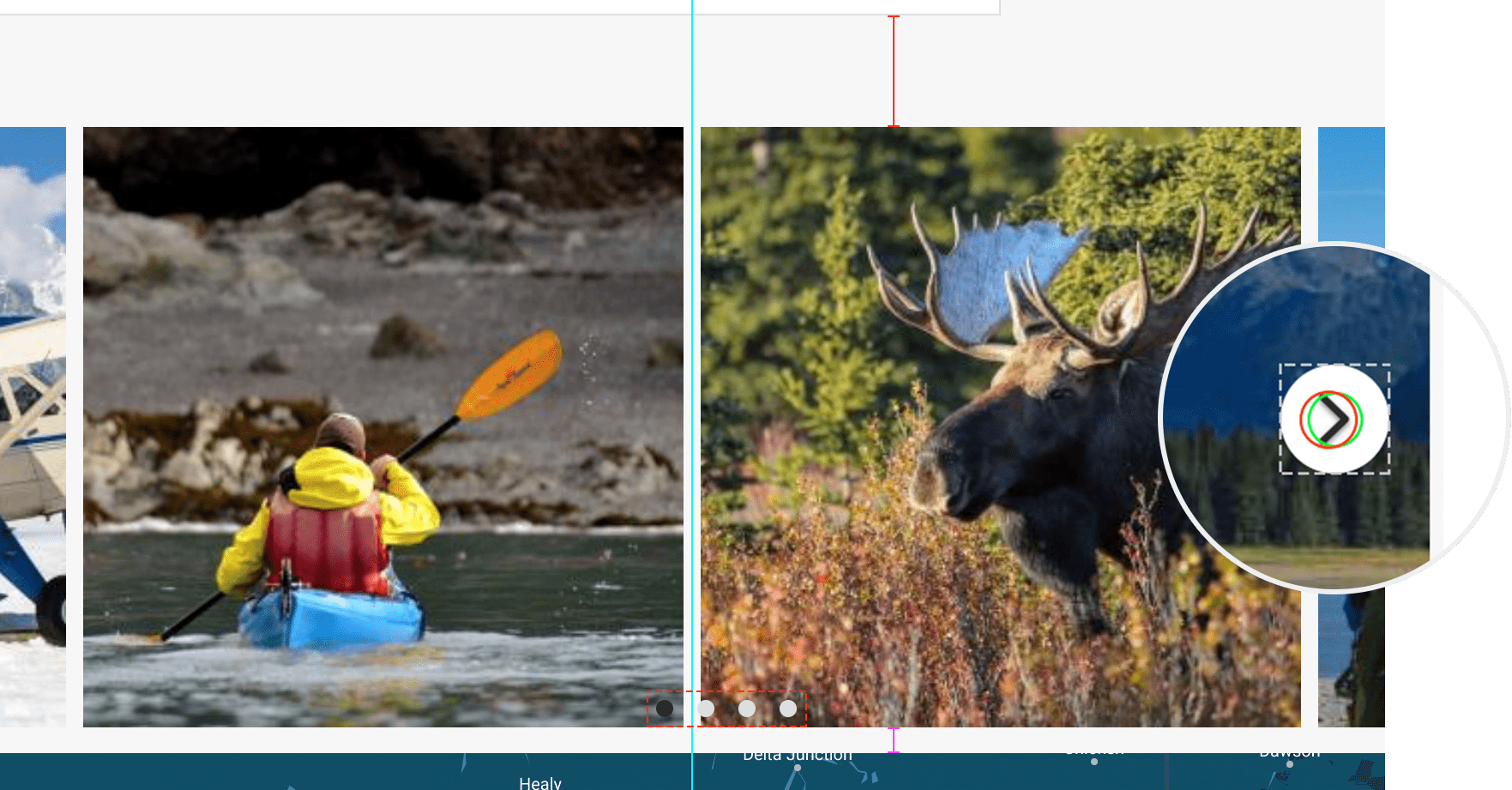
#8. Gallery Tour block: different margins of the block, misalignment of dot-navigation. Misalignment inside the button Next.
UI Bug
Current look
ProoflinkSeveritymajor
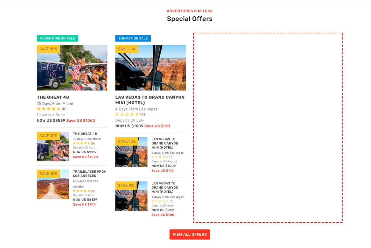
#9. There is no balance in the Special Offers block.
UI Bug
Empty space on the right results in imbalance. If visually your site is “unbalanced”, then the site will look messy and users will experience discomfort. The problem arose due to the fact that the block is designed for 4 types of Special Offers.
Current look
ProoflinkSeveritymajor
https://www.interaction-design.org/literature/article/the-building-blocks-of-visual-design
#10. In Discover Destinations, there is a hole between the Places lists.
UI Bug
Identical elements of the block should have the same indentation so that the grouping is not violated, and the block looks like an organic whole.
Current look
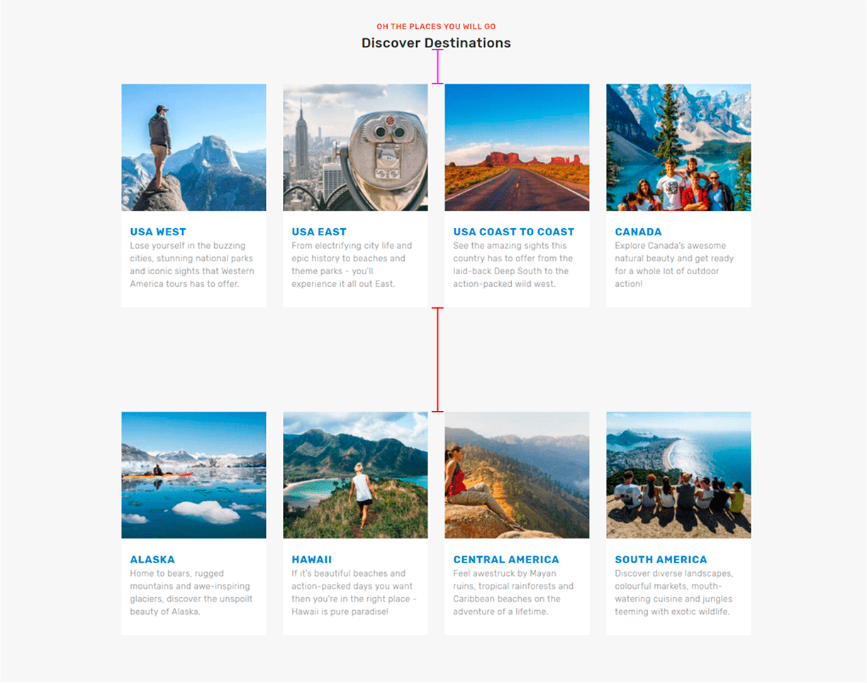
ProoflinkSeveritymajor
https://manifesto.co.uk/design-principles-gestalt-white-space-perception
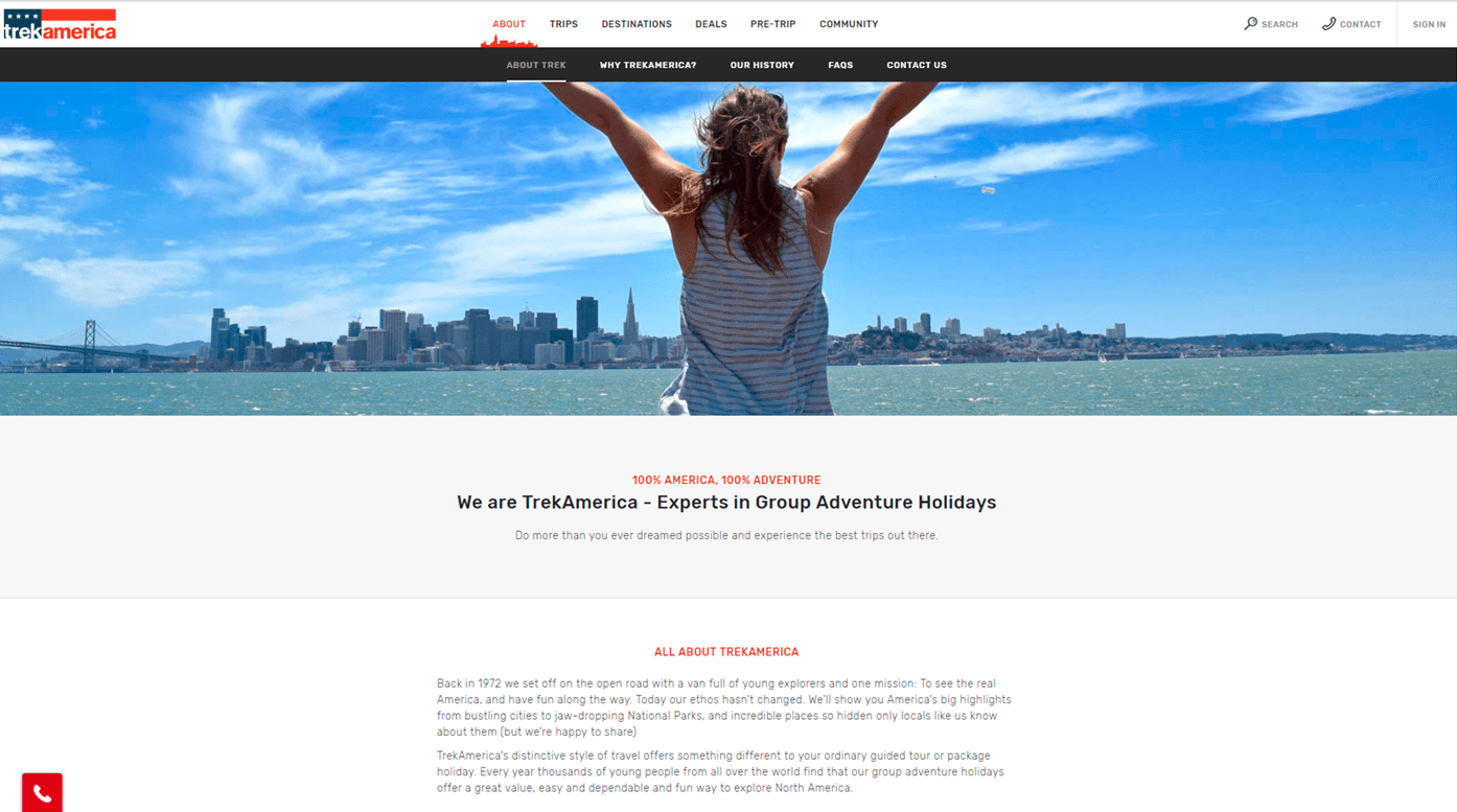
#11. Improper vertical alignment of the elements in the block We are TrekAmerica – Experts in Group Adventure Holidays.
UI Bug
Current look

Severitymajor
#12. Different indents within the block Our Spotify Playlists.
UI Bug
Current look

ProoflinkSeveritymajor
https://maddisondesigns.com/2009/03/the-5-basic-principles-of-design
#13. Low quality image in Header Home page.
UI Bug
Often so that the graphics do not slow down the work of the site it is shrinked. But this leads to discomfort interaction of the user with the site. And it makes you feel that the image is not original. Find a balance between quality and weight.
Current look

Severitymajor
#14. Low quality image. Button with different indents. In the Original Adventures Since ’72 block.
UI Bug
Current look

Severitymajor
#15. Low quality image. Button with different indents. In the Trek America Tours Goes 360 block.
UI Bug
Current look
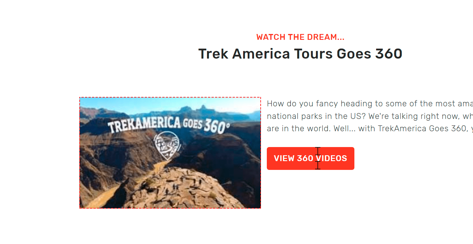
Severitymajor
#16. Low quality image in the Header History page.
UI Bug
Current look
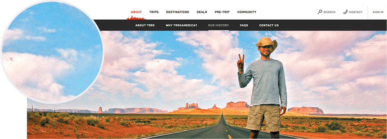
Severitymajor
#17. Insufficient quality of icons in Social Share Buttons.
UI Bug
Raster images are resolution dependent. Use svg icons on your site. They have less weight and look perfect in any resolution.
Current look

ProoflinkSeveritymajor
https://medium.com/sketch-app-sources/how-designers-should-think-about-svg-b2b92efc4d77
#18. Poor quality icons in the Get Social block. Elements’ misalignment within the block.
UI Bug
Raster images are resolution dependent.
Current look
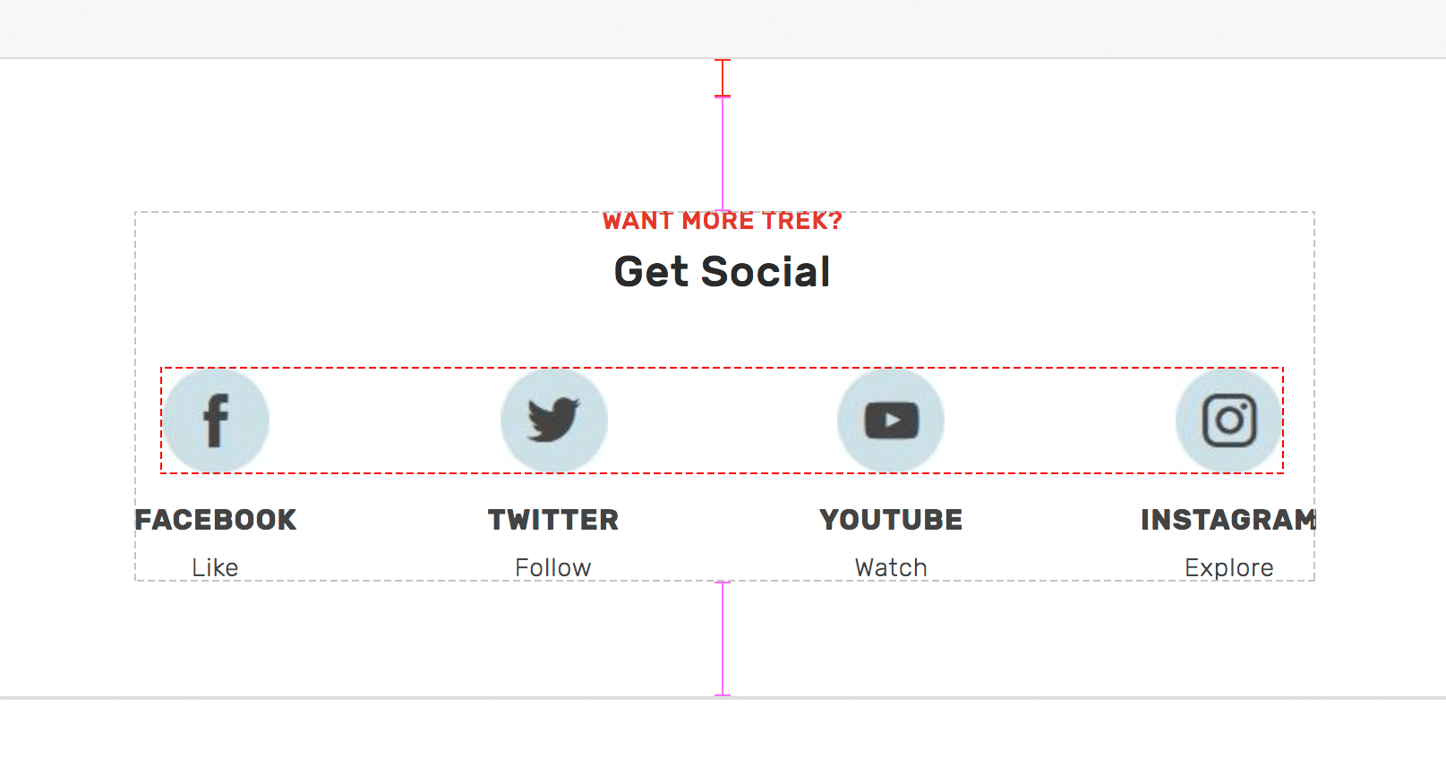
Severitymajor
TrekAmerica has been a North America tourism specialist since 1972. Pure website design. The structure is simple and logical. User attention is adroitly focused on the adventures themselves. However, somewhere low in quality content and poorly implemented details spoil the overall impression. Travel photos are a crucial element of every website dedicated for tourists. Often photos motivate the user to witness it firsthand.
Every detail of the website draws an analogy with the company’s service itself. And the better the design elements are implemented, the better the general impression of the users is, and the higher the users’ credence is.

Olga, Designer
About Redwerk
We are a software development company providing a full range of services for manifold industries like E-commerce, Business Automation, E-health, Media & Entertainment, E-government, Game Development, Startups & Innovation. Among the others, Redwerk is a web development company, and within this segregate service vector, our outsourcing web design solutions bring positive UI/UX, that sequentially turns visitors of the app into the customers.


Redwerk team comments