Taskade is one of the most modern and beautiful task managers. It’s functional, awesome looking, fast loading, and, on top of that it has default templates. However, as practice shows, minor UI bugs can be found even behind the prettiest interfaces.
#1. No hover states on some buttons
UI Bug
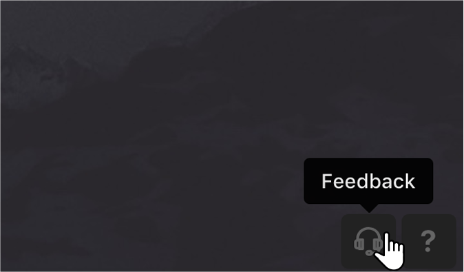
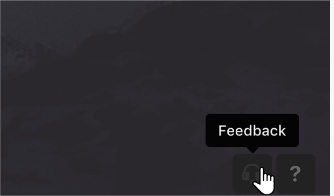
Any active web interface element should change its appearance when you hover over it. In the Taskade footer there are 5 identical style buttons: 3 on the left and 2 on the right. Hover works perfectly with the left-side buttons, but the right-side buttons don’t change their color when hovered over.
ProoflinkSeverityminor
https://www.invisionapp.com/inside-design/comprehensive-guide-designing-ux-buttons
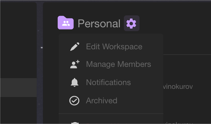
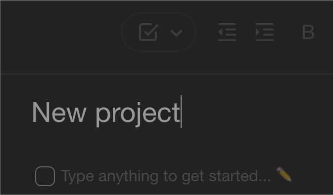
#2. Incorrect alignment of icons inside buttons
UI Bug
Icons inside the buttons should be aligned not only horizontally but also vertically. Settings icon is one of those where that rule is not perfectly applied. This especially becomes noticeable when hovering over the gear icon. It starts to move inside the button.
Current look
ProoflinkSeverityminor
https://material.io/design/iconography/product-icons.html#grid-keyline-shapes
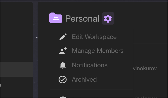
#3. Dropdowns are not highlighted
UI Bug
Dropdowns and dialog windows should differ in color from the background, or have a noticeable shadow that allows drawing user’s attention to the appeared object. When click on the Settings button, unlike other similar buttons in the black theme, we can see an obvious merging of the dropdown with the background that should be fixed. It would be appropriate to change the color of the dropdown, e.g. to #272727, then it would look like this:
ProoflinkSeverityminor
https://slickplan.com/blog/dropdown-menus-best-use-cases
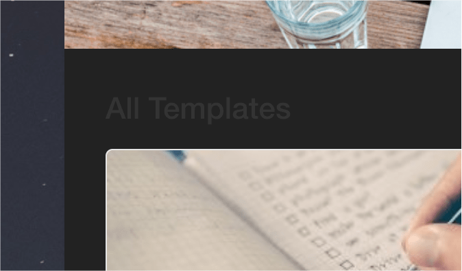
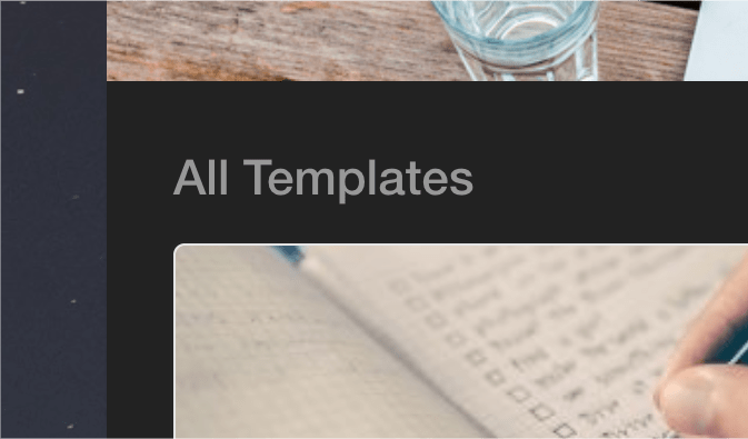
#4. Heterogeneous behavior of elements in the sidebar
UX Bug
Left-side panel links on the Downloads page https://www.taskade.com/downloads are inconsistent. E.g. when click on the Templates section the whole left panel changes but it’s not caused by any practical reason. In this case, we could leave the side panel unchanged. And if you switch to a particular template, the Templates link would still lead to All Templates.
Current look
ProoflinkSeverityminor
https://uxplanet.org/designing-navigation-labels-and-breadcrumbs-2a6220bb0cc6
#5. Color style differences
UI Bug
Some headings do not match the overall dark theme style. Let’s look at these few examples:
ProoflinkSeverityminor
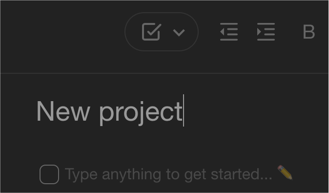
#6. Unobvious unavailability of certain functions
UX Bug
In the edit mode of the tasks list header, functions above, such as Change format, Change color, etc., are not available but it’s not reflected on the interface. In this case, the functions must either become muted when moving to the focus of editing the title, so that the user does not have the desire to press them, or must be completely hidden, since at this moment these buttons cannot be used.
ProoflinkSeverityminor
Taskade is one of the most convenient services to manage tasks. Ease of use for both personal purposes and for multi-user work, and an attractive interface with two basic themes: light and dark – make this SaaS service one of the most convenient for everyday employment. Minor UI bugs that I encountered during the analysis of this service do not affect the performance and functionality, but show only minor frontend flaws that can easily be remedied.

Alexander, Designer
About Redwerk
We are an offshore software product development company that delivers the whole gamut solutions for the industries of E-commerce, Business Automation, E-health, Media & Entertainment, E-government, Game Development, Startups & Innovation. Redwerk also provides UI/UX design and development services at the topflight level at an affordable cost. At Redwerk, we know that good idea released with high-performance backend shall be displayed in a fine frontend as well.


Redwerk team comments