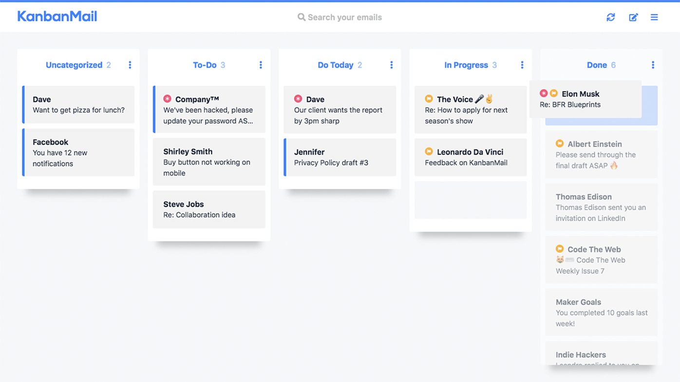
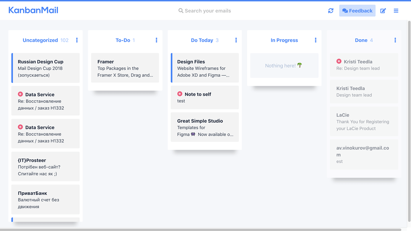
Kanbanmail is a useful and convenient web service that provides a possibility to manage the process of sorting emails using privileges of a kanban board. It’s a great GTD-tool that unfortunately has some UI and UX issues fixing which would make this web app one of the best solutions for keeping your personal mail in order.
#1. Collapse columns do not always work
UX Bug
It’s a pity for a user to not receive any reaction back from the interface when trying to take any action.
Current look
ProoflinkSeveritymajor
https://www.invisionapp.com/inside-design/comprehensive-guide-designing-ux-buttons
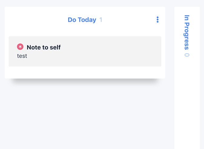
#2. Sometimes words get cut off when click on Collapse
UI Bug
#3. Filter Reset not available
UX Bug
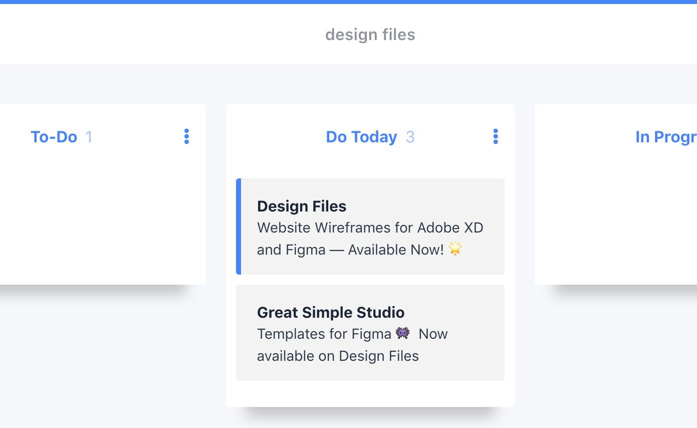
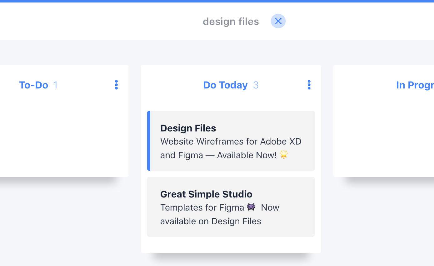
Imagine you enter a phrase “design files” in the search bar, find a needed email, read it and want to reset search results to get back to the other mails. In order to do this, you need to remove the words in the search bar manually. It would be much easier to just press Clear button or cross icon to reset the search filtration.
Current look
Proper look
#4. No hover states on some buttons
UI Bug


https://uxplanet.org/button-ux-design-best-practices-types-and-states-647cf4ae0fc6
#5. Functions are hidden
UX Improvement tip
To take any action on each email you need two clicks first: go to an email card and choose side menu. It can be simplified by adding action icons to the email card when hover over. At the very last moment, we discovered the possibility of right-clicking on an email card, but right-clicking is not obvious to the web interface, and there should definitely be a hint for that.


https://books.google.com.ua/books?id=CJpGDwAAQBAJ&pg=PA180&dq=design+
#6. Error after clicking on Contact in the footer of the home page
UX Bug
After clicking on the Contact link the whole page gets white and only reload helps to solve the issue.
Current look
#7. Horizontal scrolling in the interface
UI Bug
Current look
KanbanMail is a handy organizer for business correspondence. It’s like a Trello for mail. It is difficult to find a more convenient way to organize emails. I was impressed with Etha-a’s idea. Some identified and described bugs affect the interaction and usability of the service. With such projects, you should remember that the main functionality is the top priority, as well as regular releases of new functions and features that will expand the service capabilities.

Alexander, Designer
About Redwerk
Redwerk is an outsourcing software company that specialized in E-commerce, Business Automation, E-health, Media & Entertainment, E-government, Game Development, and Startups & Innovation. We also an outsource web design agency having own in-house team that helps create stunning looking soft products. Today, many worlds largest companies are betaking offshoring software development practice, which allows optimizing their finances, and Redwerk is one of those who provides these services for corporations.



Redwerk team comments