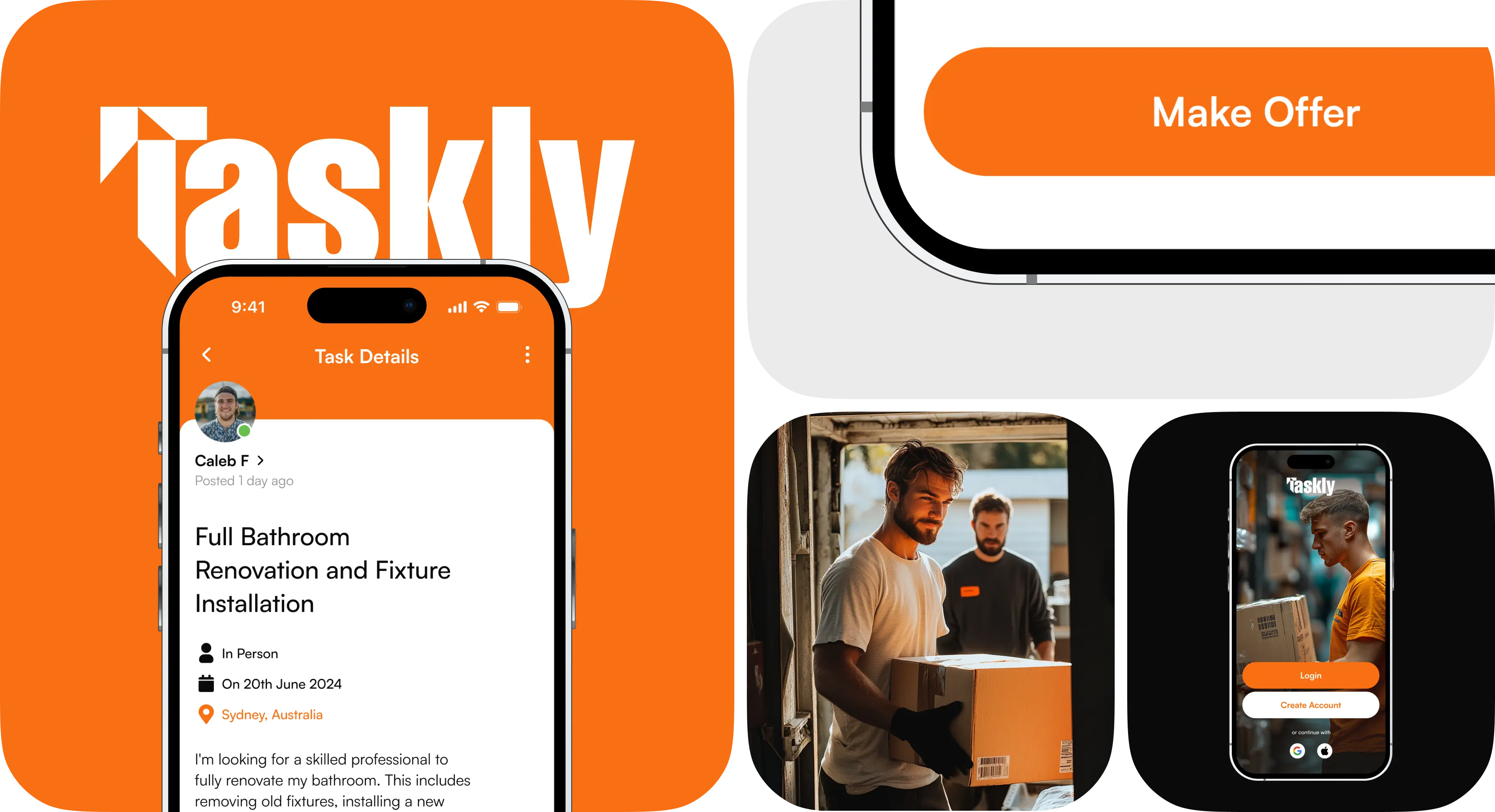
Taskly
 Taskly
Sydney, Australia


Taskly is a local services marketplace that connects individuals with skilled professionals & workers to support a wide range of tasks, which can be anything from household chores and handyman services to online projects like graphic design and writing.
All CustomersUX/UI Design
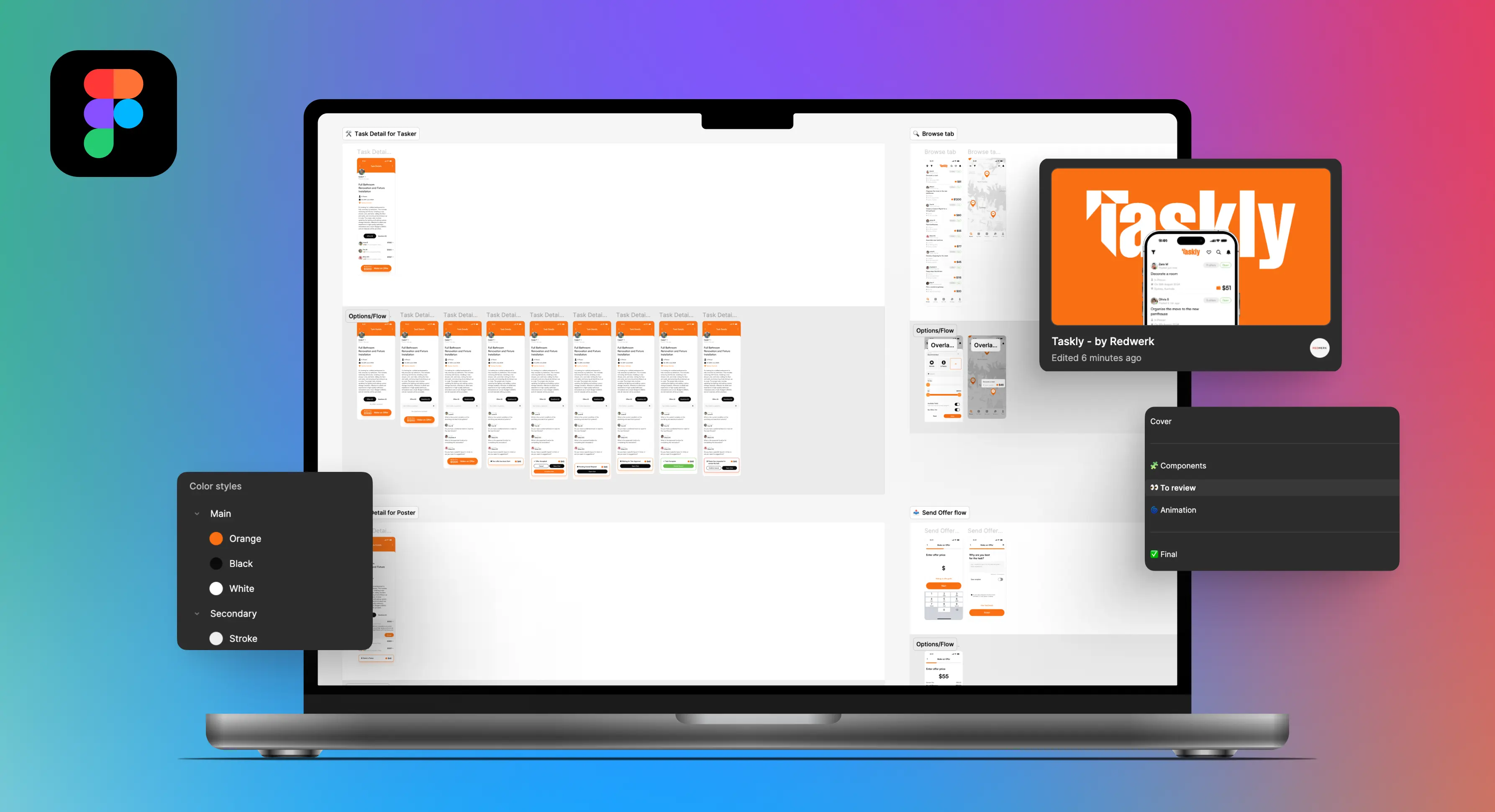
Redwerk’s UX/UI designers performed a major redesign of the Taskly app. We improved navigation of the app, making it easier for users to find what they need. We also addressed their accessibility issues, ensuring a consistent and clear user experience throughout.
Learn moreStartups & Innovation
Redwerk helped Taskly prepare for their app’s big launch in the UAE. We created a sleek yet familiar user interface that aligned with modern user expectations. Our user-centric redesign positioned Taskly for success in the new market.
Learn moreChallenge
Taskly hired Redwerk to perform a comprehensive mobile app redesign. Already established in the Australian market, they were preparing for their next launch in the UAE. Taskly’s aim was to gain a competitive advantage while penetrating this new market. However, our client was less than happy with the designs created by their previous vendor. These designs gave off an outdated vibe and didn’t reflect contemporary Western design principles.
As expected, once we performed the UX/UI audit, several issues stood out. Here is our diagnosis as to why the old design needed a major overhaul:
- Outdated & Non-Intuitive Interface: Some interface elements were difficult to perceive, making it hard for users to complete basic tasks.
- Low Contrast & Accessibility Issues: The color scheme did not meet modern accessibility standards (WCAG). This impaired text readability and made it difficult for users with disabilities to interact.
- Poor Visual Hierarchy: The old design did not clearly distinguish between primary and secondary content. Primary actions were lost among secondary elements, making it challenging to complete key tasks.
- Inconsistent User Journey: Some user scenarios were confusing or insufficiently thought out, resulting in frustration and additional questions from users.
While the original color scheme was to be retained, Redwerk was given considerable creative freedom in other areas of the app’s redesign. We were required though, to draw inspiration from market leaders like Uber & X and replicate their app’s aesthetics.
Solution
To ensure we were on the same page as the Taskly team, we began by redesigning a few important screens. We then presented these redesigns for feedback, allowing us to gauge Taskly’s preferences and align on the project’s direction. Let’s take a closer look at our key design decisions and their impact.
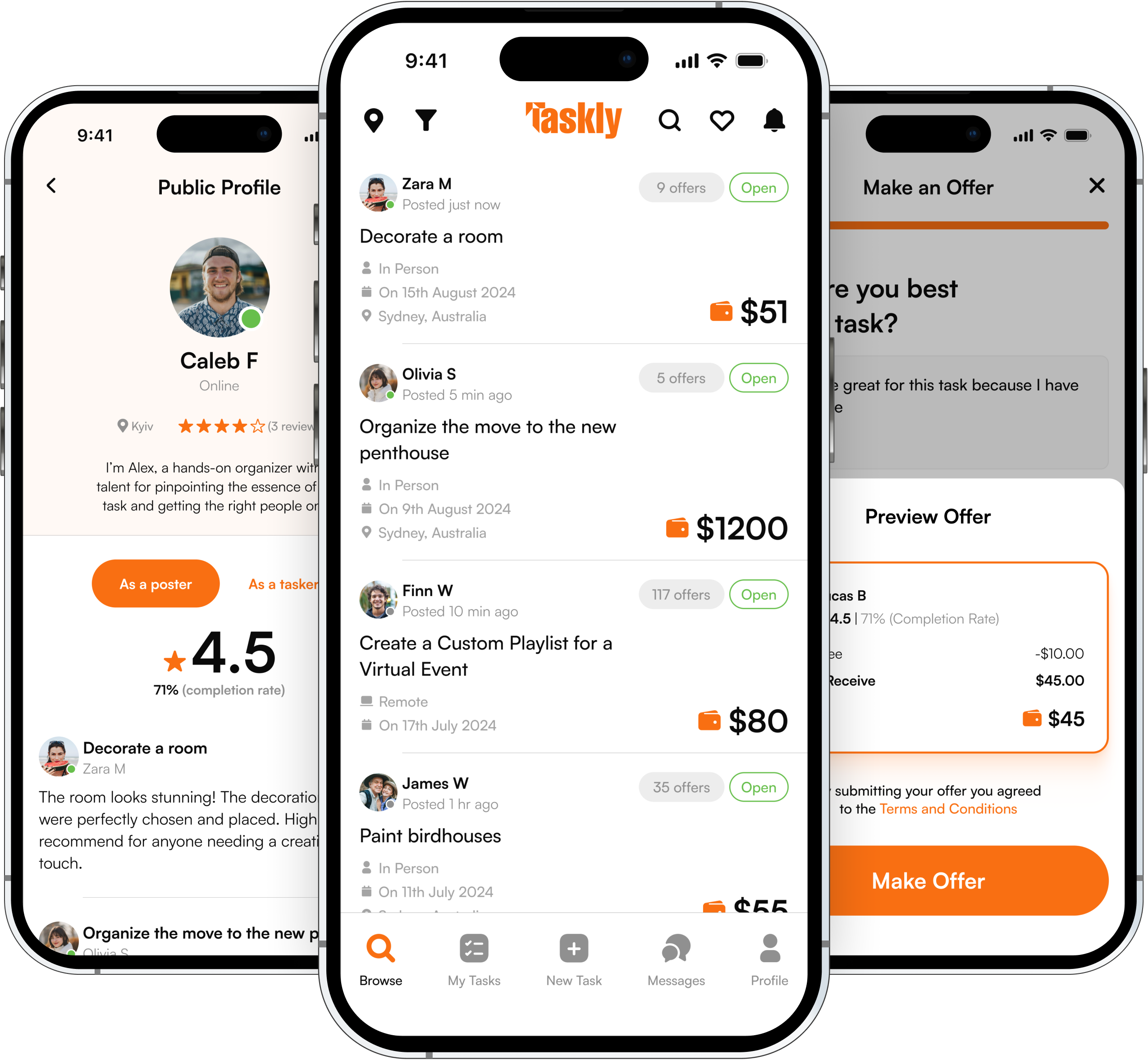
Navigation Structure Optimization
A well-defined navigation structure acts as a roadmap, guiding users through the app’s features and content. It directly impacts users’ ability to find what they seek, reducing cognitive load and frustration. A clear and logical navigation encourages users to explore more of the content and engage more deeply with the app.
We simplified the navigation, making it more intuitive. This reduced users’ time searching for necessary functions and improved their overall app experience.
Information Architecture Review
Information architecture (IA) is fundamental to creating a user-friendly and effective digital experience. Having solid IA helps users effortlessly find the information they seek. When IA is built well, users can fluidly navigate the app’s features and accomplish their goals faster.
We reorganized the presentation of information, dividing content into logical blocks and highlighting key elements. This allowed users to readily perceive information, especially in crucial flows.
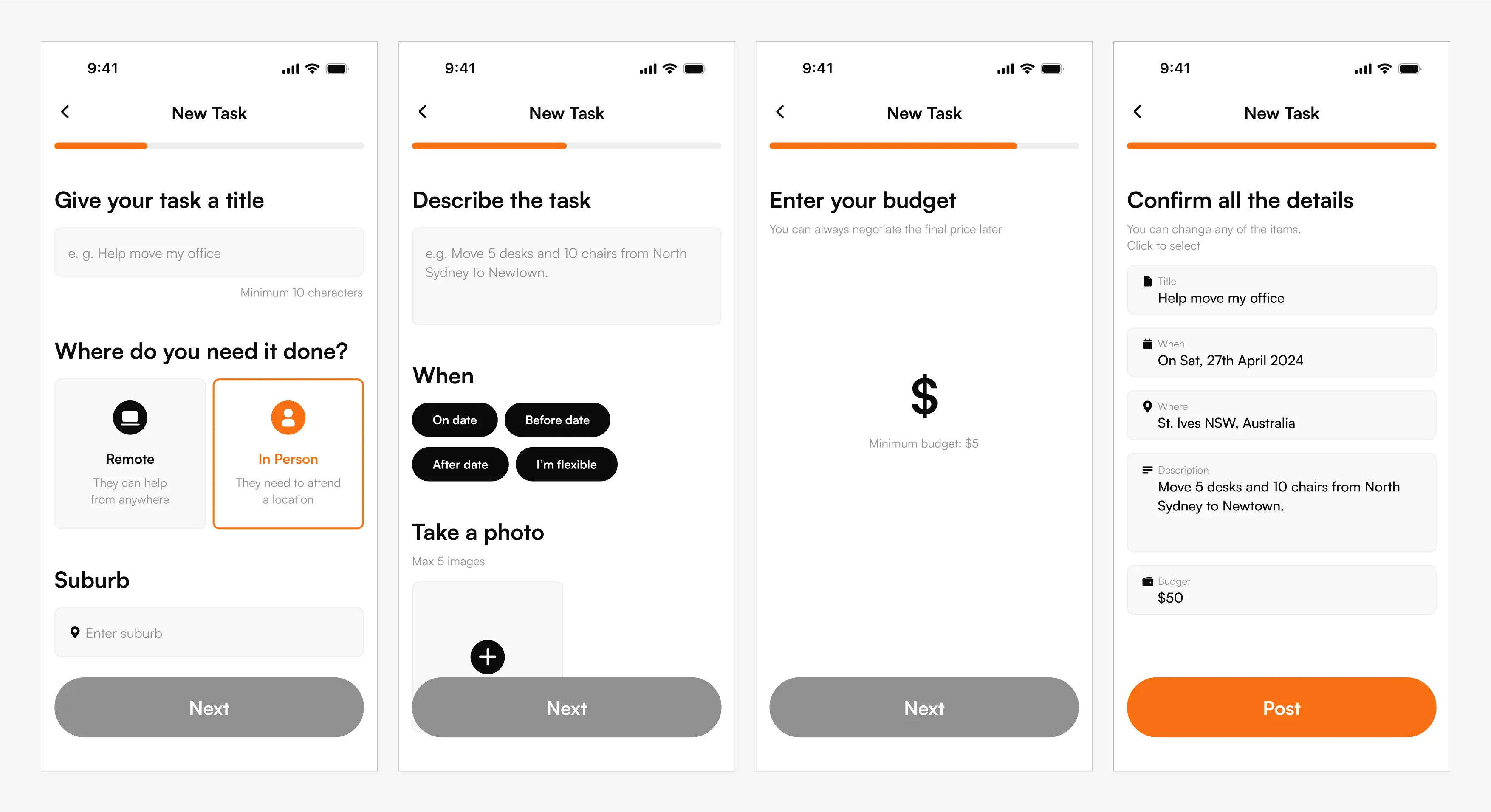
New UX Solutions for Tasker Flow & Poster Flow
We completely overhauled the user experience for creating and accepting tasks, making these core flows more intuitive and efficient.
The first issue was that the old design didn’t clearly show what stage the user was in. Were they in the process of creating a task, or accepting one? Also, the control buttons were completely non-intuitive: active buttons didn’t stand out from inactive ones, and the main control element was confused with the task content (like descriptions or proposed offers).
So, we completely revised these two key flows: The task control element became more noticeable by highlighting it as a sticky element (fixed during scrolling). This now allows the user to quickly understand elements that are the main functions for interacting with certain tasks. Buttons became larger and more contrasting, increasing accessibility and simplifying interactions. We also reviewed and improved the UX copy, making texts more action-oriented.
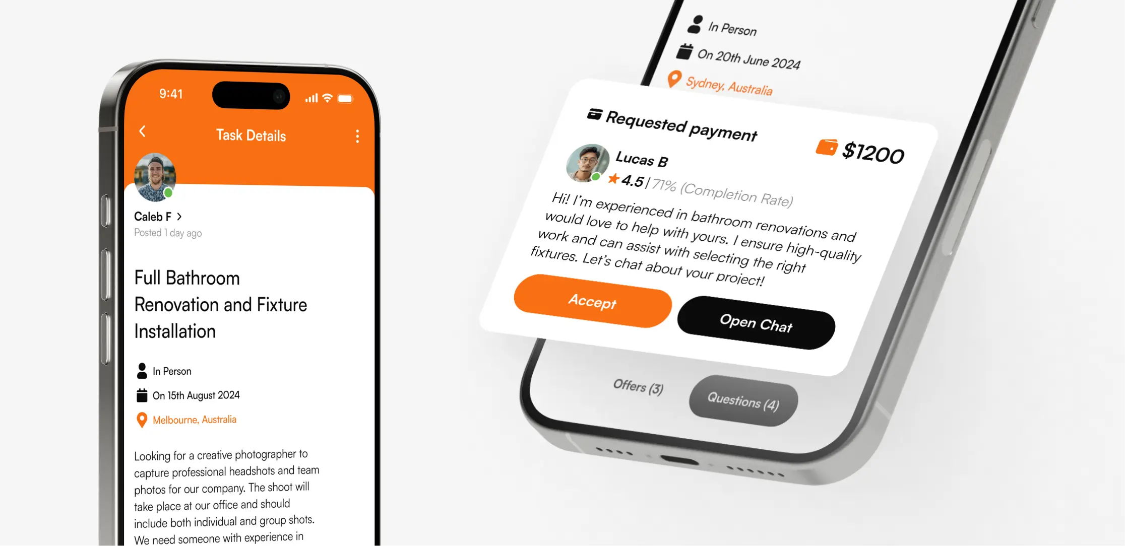
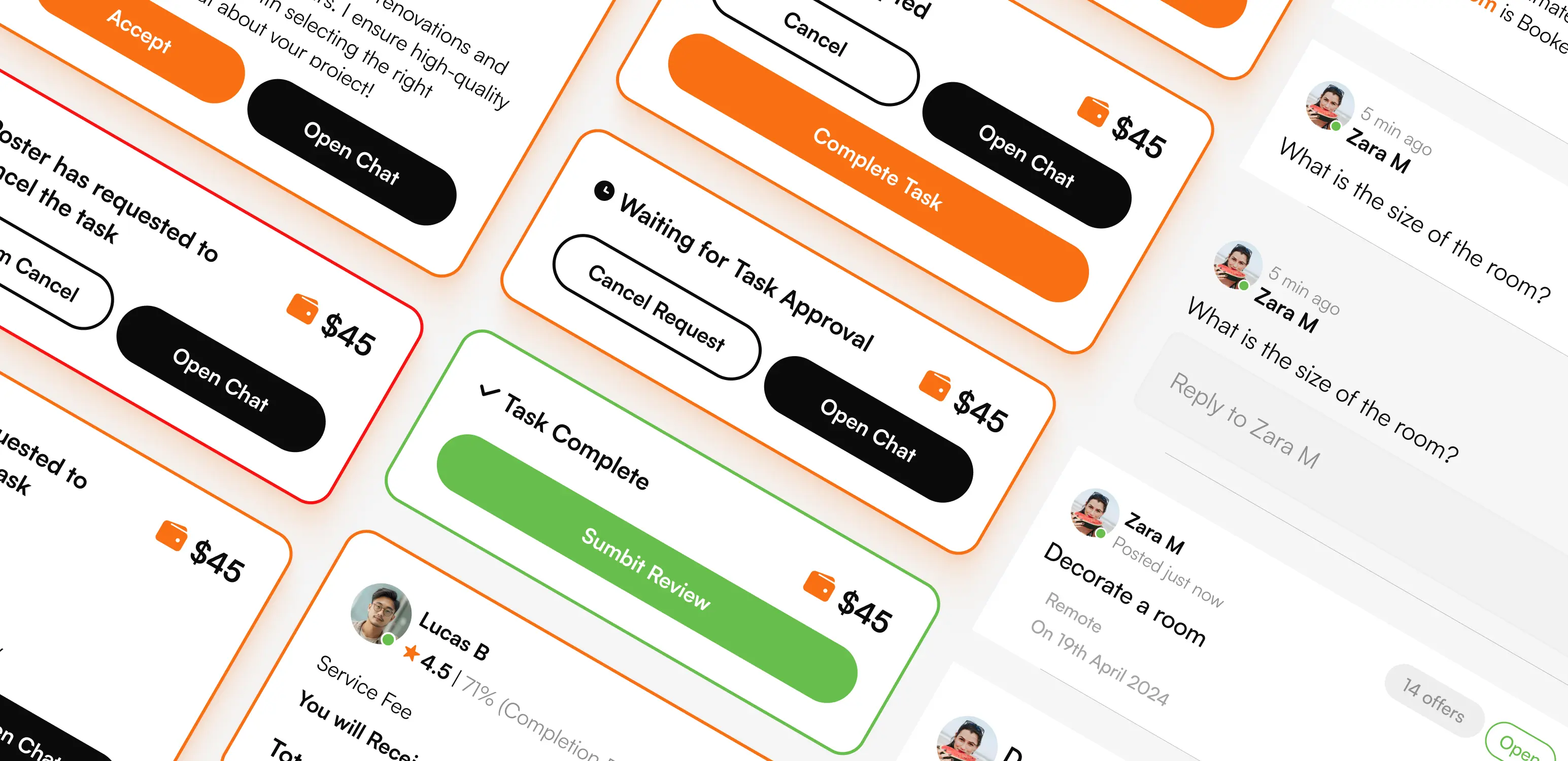
Unification of Component Style
We established a unified visual style across all components, creating a professional look and feel. This involved standardizing card designs and ensuring consistency throughout all typography, colors, and spacing.
We analyzed all types of cards in the app, such as tasks, reviews, questions, transaction history, offers, chats, and notifications. During this analysis, we identified a problem: elements in different cards—photos, names, text, labels—were not visually aligned. This created a sense of chaos, and users found it difficult to navigate the interface. We solved this problem by unifying elements in terms of structure, style, and typography. By standardizing colors and sizes, we vastly improved visual harmony and helped users quickly recognize certain types of information.
For easy access, we also created a dedicated components page. This page houses all the primary components: cards, buttons, text fields, notifications, and more. Thanks to Figma Variants and Component Properties, each component can be easily modified. For instance, in a card, you can now enable or disable an icon, add text, and change the background or label with just a few clicks. This allows for rapid adaptation of elements to various use cases without creating new components, which saves a lot of time.
Creating reusable components was necessary not only to achieve design consistency, but also cost-efficiency. Changes made to a component were automatically updated everywhere it was used, streamlining maintenance and reducing future costs.
Animation & Microinteractions
We added animated transitions between screens to make navigation within the app smoother. These animations help users better orient themselves in the process and feel a connection between the different stages of interaction within the app. Smooth transitions reduce jumps between screens and make the user experience more enjoyable, which is especially important for users on mobile devices.
Additionally, we implemented microinteractions to enhance interactivity and provide a sense of completion for actions. For example, after successfully creating a task, the user sees an animated checkmark that indicates success and confirms that the action has been performed. This creates a moment of satisfaction and gives the user explicit confirmation that the task has been successfully created.
UX/UI Prototype
Prototyping grants the ability to test the flow of user interactions early in the process, minimizing costly redesigns and iterations during development. It also helps designers walk in the users’ shoes, allowing them to understand their needs and behaviors better, leading to a more user-centered design.
Building an interactive prototype helps us spot problems with how people navigate the product or other usability issues that we might miss otherwise.
For this project, we built a prototype that outlined the primary and secondary screens to see how users would flow through the app. This helped us create a clear picture of the entire user experience, showing how users interact with the app at every step. This approach ensured that the final product truly met the needs and expectations of Taskly’s users.
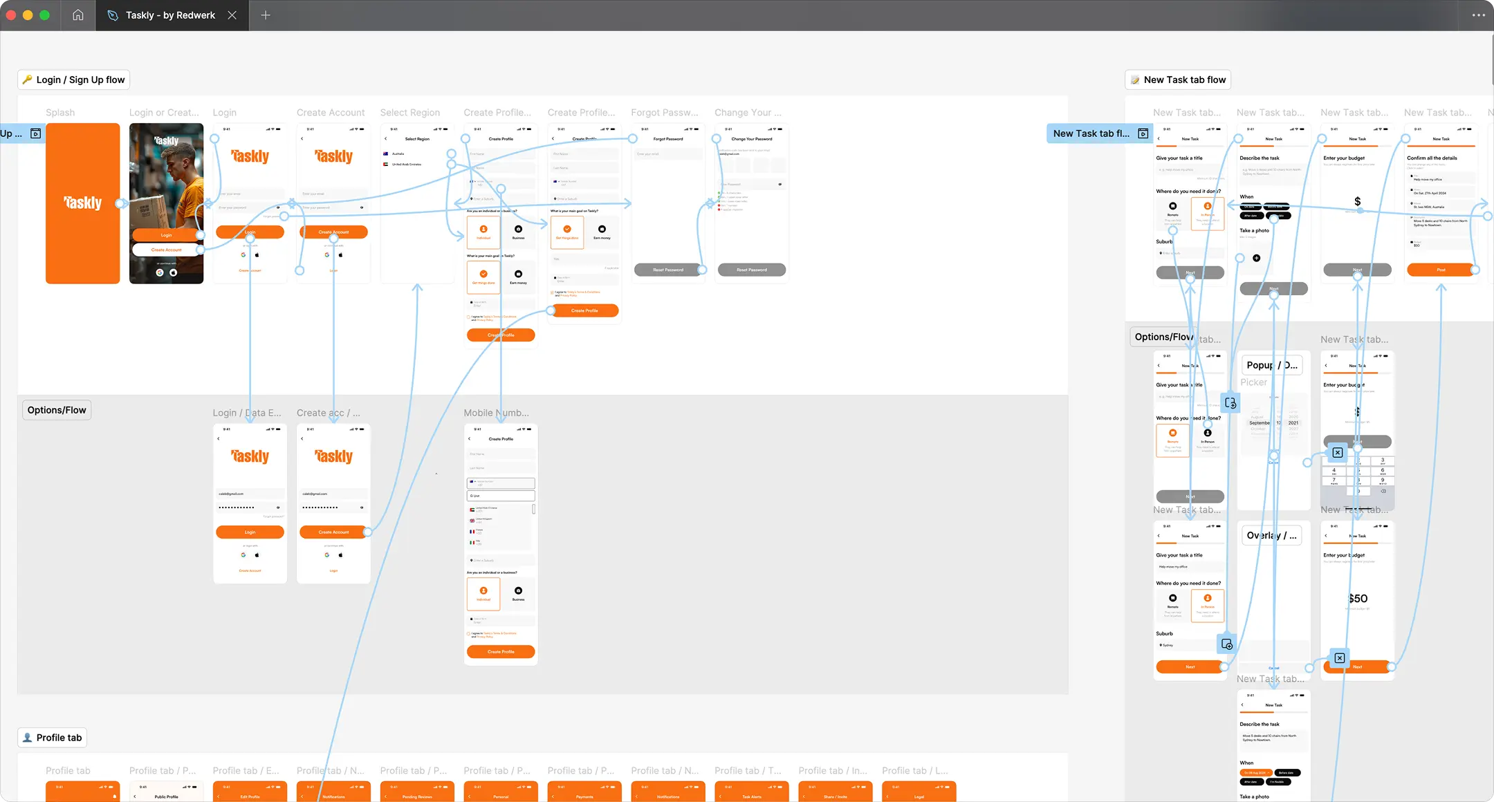
Streamlined Handoff with Figma
A well-organized Figma file can significantly improve the developer’s experience, minimizing back-and-forth and enabling immediate implementation. We organized the design in Figma in a way that ensures a smooth workflow for everyone involved. We wanted Taskly to easily navigate the project and monitor our progress.
We created several categories to clearly separate designs based on their status: screens in development, screens for client review, and screens for final, approved versions. In addition to the main design, a separate page was created for animations, where all dynamic elements and prototypes were neatly grouped, ready for handoff to development.
By streamlining the design-to-development process, organizations can save time and money. This efficient handoff benefited Taskly by accelerating their development cycles and reducing time-to-market.


Result
Redwerk’s design team helped Taskly perform a professional app redesign, significantly improving user experience. We streamlined navigation and completely revamped core user flows, which reduced user frustration and increased overall satisfaction. This resulted in higher task completion rates, making the platform more efficient for both users and service providers.
The refreshed UX/UI also enhanced the app’s brand perception. It now looks more modern and appealing, attracting a wider audience. This redesign enabled Taskly to achieve their goal, and launch successfully in the UAE market.

I had the pleasure of working with the Redwerk team on a major UX overhaul for my app, and I couldn’t be more impressed with the results. Their commitment to quality were evident throughout the entire process. They took the time to fully understand our vision and delivered a user experience that not only met our expectations but exceeded them.

Looking to improve your app’s user experience?
Talk to our experts!Technologies
 Figma
Figma Aninix
 Mobbin
 Lottie Animations
 MidJourney
Redwerk Team Comment

Mykhailo
UX/UI Designer
I really leaned on components in Figma to create a solid design system that was easy to use both for me and the developers. Using components helped me maintain consistency in the interface, save time, and simplify design maintenance. I also got to play around with animation, which added a nice touch and made the interface more engaging for users.
Related in Blog

15 Mobile App Development Trends for 2025
Mobile app development trends are filling the agenda of numerous tech conferences, and for a good reason. Mobile app downloads stagnated after the surge caused by the pandemic, which means tech founders, product managers, and CTOs must innovate fast to grow their user bases and e...
Read More
Front-End Style Guides: Components, Specifications, Definition
Have you ever built a website that looked amazing in your head but somehow ended up looking like Frankenstein’s monster when you put it all together? Yeah, we’ve all been there. And it happens to mature businesses, too. Over time, your website or app evolves, but with each update...
Read More