Have you ever built a website that looked amazing in your head but somehow ended up looking like Frankenstein’s monster when you put it all together? Yeah, we’ve all been there. And it happens to mature businesses, too. Over time, your website or app evolves, but with each update, inconsistencies creep in.
Clashing colors, mismatched fonts, and elements that don’t play well together confuse your users and dilute your brand image. Inconsistent design turns updates into a developer’s worst nightmare, adding hours and maybe a few tears to the process. But fear not – we have a solution for you!
At Redwerk, we’ve seen firsthand how a solid style guide can transform a project. We’re sharing our expertise in UI/UX design and web development to help you grasp the what, why, and how of front-end style guides. In this article, we’ll cover:
Understanding front-end style guides
A front-end style guide is a document that outlines the visual and technical elements of a website or app. It’s a single source of truth for developers and designers, helping teams avoid disjointed user experiences.
Remember that a front-end style guide is not a brand style guide. While a brand style guide focuses on the brand identity, a front-end style guide details the visual and coding aspects that bring that brand identity to life.
Front-end style guides usually come in two formats:
- Static style guide. It’s a PDF or Word file that requires manual updates and distribution; suitable for smaller projects.
- Living style guide. It’s a web-based document or website that showcases UI in an interactive format and offers collaboration features. It’s a preferred format since updates to a front-end component can be automatically applied throughout the entire project.
Benefits of front-end style guides
Sleek front-end design boosts user experience and drives operational efficiencies. Here is how.
- Enhanced brand identity. A consistent design across all platforms reinforces your brand identity.
- Increased development efficiency. Clear front-end specifications save developers’ time spent on design decisions and eliminate guesswork.
- Improved user engagement and satisfaction. A well-designed and consistent website creates a positive first impression and makes user navigation effortless.
- Easier onboarding. Having front-end documentation handy, newly hired developers or designers can quickly get up to speed.
- Cleaner codebase. By describing front-end design patterns, a style guide promotes writing cleaner, reusable, and more maintainable code.
Incorporating a front-end style guide into your development process is a strategic business move that can lead to more cohesive branding, cost savings, and a stronger connection with your audience.
Core principles of effective front-end design
When crafting a front-end style guide, start with these web design principles that ensure your product not only looks good but also functions well for all users.
- Responsiveness – essential to ensure your website adapts fluidly to different screen sizes and orientations. Think of flexible grid layouts, responsive image handling, and the use of media queries in CSS.
- User experience – influences how users interact with and perceive a digital product. A great UX facilitates an intuitive, engaging, and efficient user journey.
- Consistency – ensures that your app maintains a uniform look and feel across all its pages and features. This uniformity helps users learn the interface faster and navigate more intuitively, as repeated design patterns are easier to recognize and understand.
- Accessibility – makes websites and apps usable for everyone, including those with disabilities. This means ensuring content compatibility with screen readers, designing for keyboard-only users, implementing high-contrast color schemes, and following other web accessibility standards.
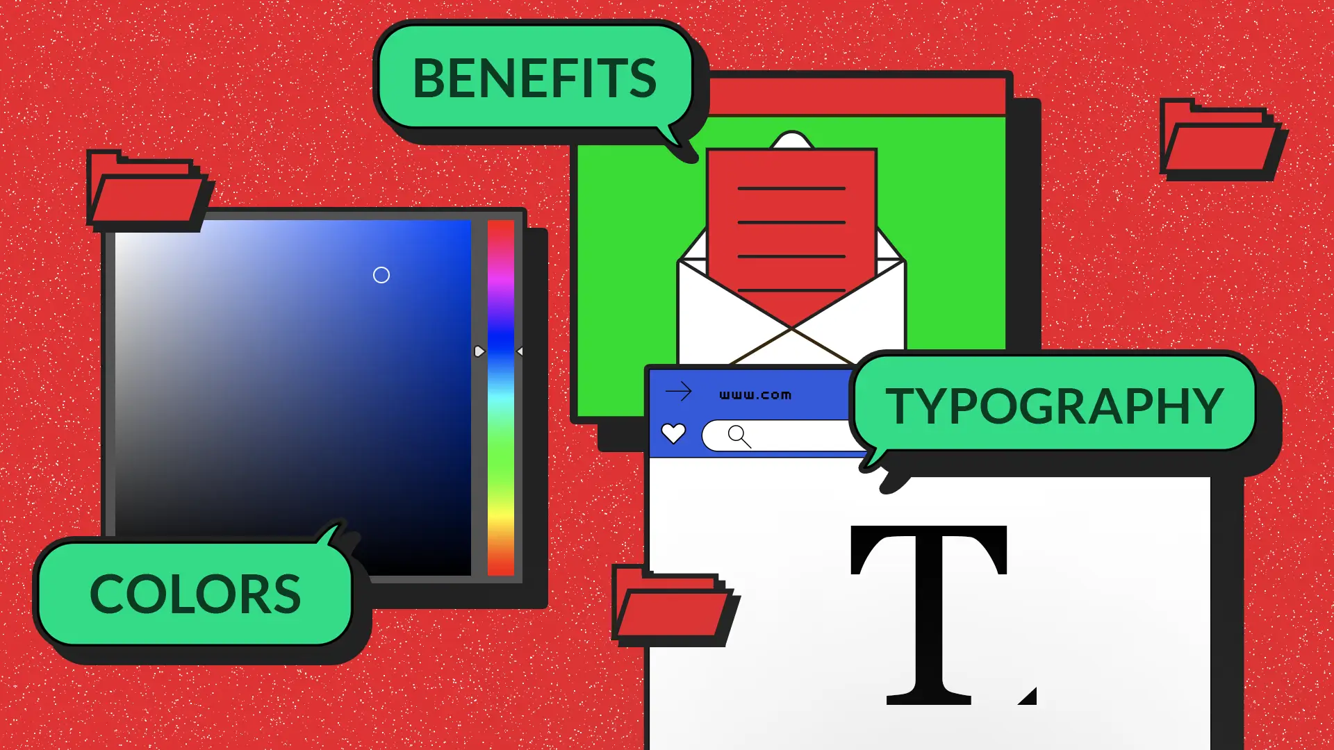
What makes a comprehensive front-end style guide?
What user interface rules and front-end components should be included in a style guide? The exact list will differ slightly from project to project. We’ve listed the absolute must-haves here.
Typography
Typography in web design is a powerful tool that goes beyond choosing attractive fonts. It helps create a visual hierarchy, guiding the user’s attention to where it matters most and ensuring readability across devices.
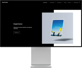
For example, we combined Rubik and Play when choosing fonts for Tingl, a web3 messenger with a playful brand identity. The informal nature of the Rubik font creates a sense of lightness and accessibility. Play, on the other hand, has a bolder and more expressive style, making it an ideal choice for highlighting more important information. This font pair allows for an optimal balance between lightness and expressiveness, ensuring a clear and attractive visual

Typography guidelines usually include information about font families, sizes, weights, line heights, and color palettes.
Color palette
The color palette of a product does more than just please the eye; it sets the emotional tone and reinforces brand identity. Thoughtful color choices can influence user perception and improve accessibility.
For example, when creating a landing page for Dropp.TV, a web3 shoppable streaming platform, we opted for a dark theme accented with trending neon colors. These colors reflect the platform’s progressive spirit and futuristic appeal and resonate with its target audience of artists and creators.

The color palette section should define the core color scheme of the website, divided into primary, secondary, and accent colors. It should also specify how each color is used for backgrounds, text, links, and other elements.
Your style guide should emphasize the importance of ensuring sufficient color contrast between text and backgrounds. This caters to users with visual impairments, who rely on clear contrast to distinguish information.
Front-end components
Front-end components are reusable building blocks that make up the interactive elements of a website or web app. They encapsulate a specific functionality and visual appearance, allowing developers to easily construct complex user interfaces by combining these components.
Here are a few examples of front-end components that are typically included in a style guide:
- Forms
- Buttons
- Sliders
- Accordions
- Carousels
- Navigation menus
- Drop-downs
- Dialogs
- Breadcrumbs
- Progress bars
- Tooltips
- Icons
Suppose we’re looking at front-end specifications of a button. In this case, an interface component library should detail different button types along with their visual styles, hover states, and interaction behavior.
If you’re looking for web style guide examples, here’s a sneak peek into a guide we developed for 9yahds, an incident response platform. When designing front-end components, we prioritized convenience and upgradability.

Layout
A solid layout system creates a structured and visually balanced user interface. It ensures a user-friendly experience across various screen sizes, from desktop monitors to mobile devices.
The grid system is one of the most crucial elements in establishing a strong layout. It ensures elements are aligned and spaced evenly across different pages. This creates a sense of order and visual harmony, making it easier for users to navigate and find the information they need.
Beyond the grid system, the style guide should define spacing, margins, and paddings. Consistent spacing between elements like text, images, and buttons prevents content from feeling cramped or cluttered. Margins and paddings, in their turn, further enhance readability and visual hierarchy.
Also, the layout section should address breakpoints at which the website’s layout adapts to different screens, resizing elements, and rearranging content to optimize the user viewing experience.
Here is a layout we developed for Kudy Financials, an investment platform. The goals were to increase the readability of the portfolio dashboard, simplify navigation, and create an adaptive design that would satisfy the needs of mobile users.

Icons and imagery
When it comes to front-end design, icons and imagery are not just decorative elements. They act as miniature storytellers, adding visual interest, conveying information efficiently, and reinforcing your brand message in a way that text alone sometimes cannot.
For Tingl, a cutting-edge web3 messenger, we set out to create imagery that would truly stand out. Our approach was to blend the distinct styles of neo-brutalism and comic art. This artsy and playful visual language perfectly embodies Tingl’s fun and edgy vibe. A prime example is Tingl’s mascot, a character that draws inspiration from Rebel, Jester, and Explorer archetypes, adding depth and memorability to our brand icon.
A front-end style guide establishes clear rules for the overall aesthetic and characteristics of these elements. Are icons primarily monochromatic, or do they incorporate a specific brand color scheme? Are line styles thin and minimalistic, or do they have a thicker, bolder outline? These are just some questions a UX style guide should answer.
Coding standards & specifications
This section of your style guide focuses on the technical aspects of web development. It can also outline front-end development best practices. This helps reduce errors and ensure your codebase is clean, consistent, and maintainable, resulting in a more robust and successful web app.
Code specifications
Each UI element described in your style guide should have respective code specifications. This step not only simplifies developer’s life but also ensures each component is implemented consistently.
For typography, for example, you can include CSS rules for font family, size, weight, line height, and text color. When describing a color scheme, provide hexadecimal, RGB, or HSL values for your color palette so that the colors are matched precisely.
Front-end components like buttons, input fields, or navigation menus should have HTML and CSS code snippets, detailing padding, margins, border radius, background colors, hover states, and animation effects if any.
Naming conventions
Naming conventions are established rules for naming HTML elements, CSS classes and IDs, JavaScript variables, and functions. They reduce confusion during code reviews or when someone else needs to pick up development work. This, in turn, leads to better code readability.
The specific naming conventions you choose are not as important as ensuring consistency throughout your project. Fortunately, automatic tools, such as linters, can help enforce these conventions.
Code organization
As websites grow in complexity, disorganized code can quickly become a tangled mess. Clear organization helps break down the code into manageable pieces, making it easier to understand how everything works together.
Effective code organization often involves breaking down the codebase into smaller, reusable modules that represent specific UI components, functionalities, or styles. This modular approach promotes code reusability, allowing developers to easily integrate existing components into new features without rewriting everything from scratch.
Choosing tools for your style guide
Now that you understand key components of a style guide, it’s time to consider the tools that will best suit your project.
UI/UX Design Tools:
- Figma – a collaborative design tool tailored for real-time co-creation on designs, devising design systems, and translating designs into code
- Penpot – an open-source design and prototyping platform streamlining designer-developer collaboration
- Sketch – a powerful design tool for creating user interfaces with a focus on vector-based solutions
- Adobe XD – a design and prototyping tool for creating and sharing interactive user experiences
Web Development Tools:
- Stylelint – a CSS linter that scans your code for errors and stylistic inconsistencies
- ESLint – a static code analyzer for identifying problematic patterns in JavaScript
- Prettier – a code formatter that ensures consistent indentation, spacing, and formatting
- WAVE – a web accessibility evaluation tool helping developers make web content accessible to users with disabilities
Documentation & Collaboration Tools:
- Zeplin – turns design files into a specification document where developers can easily see sizes, colors, and fonts
- InVision – offers a platform for prototyping and collaboration, helping teams visualize and iterate designs
- Notion – allows compiling guidelines in a structured and accessible format thanks to its flexibility in handling text, tables, and media
Summing up
A detailed front-end style guide will help you build web apps that are beautiful, functional, maintainable, and scalable in the long run. Remember that it’s not a static document; it’s a living entity that evolves with your brand, technology, and user needs. Keep your style guide updated and relevant for your digital products’ coherence and continued success.
Need help with creating a professional UX style guide or an entire design system? Feel free to contact us to discuss your project and get a quote.
FAQ
What is a front-end style guide?
A front-end style guide is a living document that defines the visual language of your digital product. It outlines the specific rules and best practices for elements like typography, colors, layout, icons & illustrations, buttons & forms.
Who should be involved in creating a front-end style guide?
It’s typically a collaborative effort involving designers, developers, and project stakeholders to cover all design aspects.
Can one front-end style guide fit all projects?
Not always. While some elements are universal, customizing to fit specific project needs is often necessary.
What are the key components of a front-end style guide?
Essential components include typography, color palette, UI elements, layout principles, and coding standards.
How can I ensure that my team adheres to the front-end style guide?
Regular training, clear documentation, and periodic reviews help maintain adherence to the guide.
See how we helped Northeastern University implement a living style guide to streamline branding across 3,000 faculties