M3 Glass
Irving, Texas, USA


M3 Glass Technologies is a Texas-based provider of innovative custom glass design and manufacturing. The company offers decorative design-glass covering a variety of products – from flooring to walls. M3 provides a full range of aesthetically pleasing options for both private and commercial locations that would outfit the premises with style and flair.
All CustomersProduct Development
M3 Glass Technologies came to us with the idea of implementing an interactive design tool that would allow customers to visualize the look of their space after applying the desired glass designs.
Learn moreStartups & Innovation
Redwerk knows how to implement innovative business ideas in an efficient way. We develop products that companies are proud of, products that are used by consumers, and products that last.
Learn moreChallenge
M3 Glass Technologies came to Redwerk with a ready-made website, willing to create a configuration tool to enhance their customers’ online experience. In a physical store, clients can quickly reach a consultant for assistance; however, when they purchase online, the only options left are either to fill out the contact form or to rely on self-service. While the first scenario may be frustrating and time-consuming, the second one can be transformed into a powerful engagement tool. Customers do not mind self-service as long as they can easily get what they need. Configurators are, in a way, virtual shop assistants that collect customers’ preferences and then match them with available items. From car selection to glass design, configuration tools are now widely used in many industries.
M3 Glass Technologies asked us to design an interactive visualization tool so that customers could bring their ideas to life. Apart from providing the options to select a pattern, customize its scale and color, it was important to give the customers’ designs the touch of real life. For that, M3 Glass required us to create 3D models of a glass door and wall so that patterns could be applied on top of them. It was equally important to make the glass design configurator easy to use and get the hang of.
One of the main requirements was to make the design responsive, focusing on a large Mac, latest versions of iOS and Android tablets, and a regular laptop. Of course, we wanted to make the interactive tool mobile-friendly as well.
We also had to make sure that all the patterns look neat in different versions of the following browsers: Chrome, Edge, Safari, and Firefox.
Solution
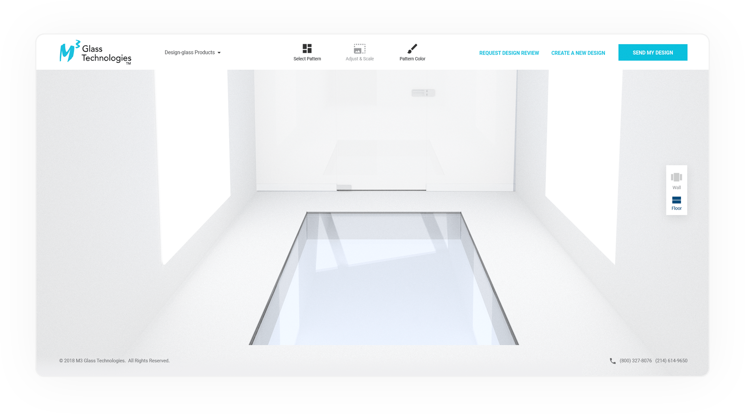
The design team created separate 3D images of a glass wall and floor so that later the patterns from the client’s menu could be superimposed on these transparent backgrounds. M3 Glass Technologies provided us with the patterns catalog, and our part was to enable the transfer of the pattern onto the glass model with the help of HTML and CSS. We also had to consider the image perspective for the glass design to look realistic. To make the graphics perfect regardless of the transformation, we used the SVG format.
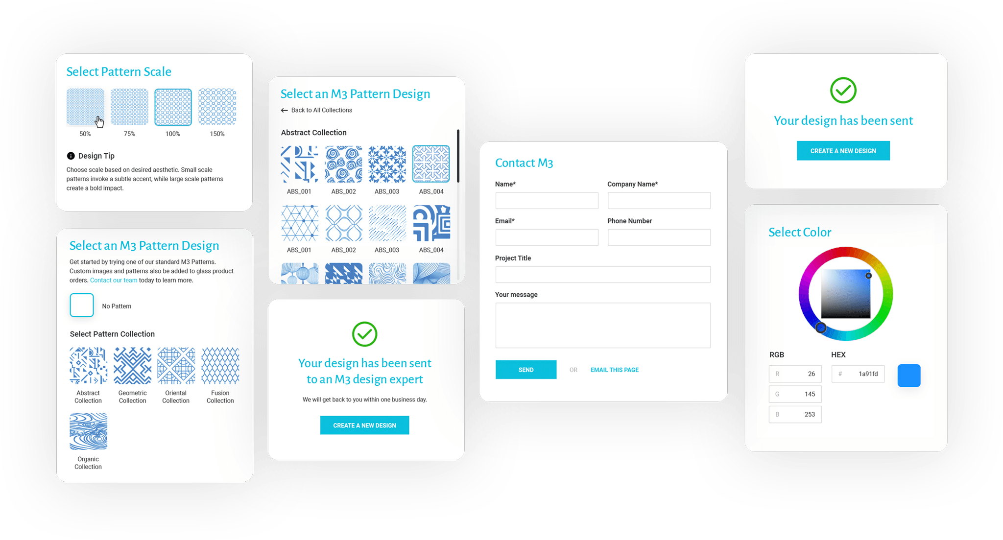
On top of that, our designers created an interface for the interactive tool so that M3 Glass consumers could easily visualize their glass-design ideas and customize the available pattern to their liking.
The online interactive tool interface consists of:
- pattern selection board
- pattern scale board with design tips
- color wheel both for the pattern and the background
- background selection panel
- create new design button
- request design review form
- send my design form
- thank you page with the option to download a PDF mockup of the created glass design.
We were guided by the fact that the interface should not distract from the product itself. Therefore, we went for a simple, neutral design with a focus on the target audience. Since most of M3 Glass consumers are mature people, we provided some tips for action but did not overload the interface with insignificant details. The final product has all the needed functionality and is easy to use and navigate.
Development
Initially, we worked with CSS mask and background properties to display the required pattern; however, Edge doesn’t support this approach, so we needed to find another way of displaying images. We had to change the SVG color/pattern on the back-end, and we did it for all possible site modules.
We used transformation matrices for glass patterns in SVG. Everything worked well, but we noticed that not all designs got adapted (some of them did not change in color, whereas others were distorted in structure). Thus, we needed to check all the templates and bring them all to the same format.
After that, we managed to display the correct projection and color, which allowed us to send the final result to the end-user.
Result
During the time of our partnership, we have succeeded in assembling a cooperative team and optimized all project management and development processes. Due to our productive teamwork and lingering experience in web development, we managed to deliver a quality product within the deadline.
As a result, the product we developed allows customers to experiment with the selection of patterns for their glass floors, walls, commercial or private spaces. Moreover, the chosen pattern can be easily adjusted in terms of color palette and size.
Now this interactive tool is an important part of the website as it catches consumers’ attention and lures them in developing their custom glass designs. While M3 Glass clients enjoy their artistic freedom, the company reaps the benefits of increased user engagement that, in turn, drives sales.
Need Web development services?
Let’s talkTechnologies
Redwerk Team Comments

Olga
Designer
I had two tasks in this project. The first one required to design two separate 3D backgrounds – one for a glass floor and the other one for a glass wall. These backgrounds serve as the so-called “dummies” that users can decorate with various patterns and colors available in the given menu. The backgrounds had to be neutral so that any color would look good on them.
The second task concerned extracting patterns from the client’s catalog and preparing vector images. And this is the challenging part. The matter is that some patterns contained too many dots, so we had to delete a number of paths and groups while preserving the original design and making sure it is pixel perfect. At the same time, some vector graphic editors add unnecessary paths and groups when the image is saved in SVG format. These extra paths and groups distort the browser display of patterns in perspective, especially when custom colors are applied.Regardless of the difficulties, we managed to deliver a polished product to our client.

Kirill
Developer
During the realization of this project, we pumped our skills in creating an interactive tool from scratch. The challenge was to synchronize the back-end with front-end and to keep the quality of visual materials. But we identified the problem and provided a working solution due to the professionalism of our team, and delivered a great result that fully satisfied our partner.
Impressed?
Hire usOther Case Studies
Animatron
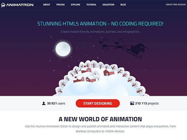
Expanded functionality of startup animation maker recognized by business media like Entrepreneur, MonsterPost, and Freelancer
CDP Blitz
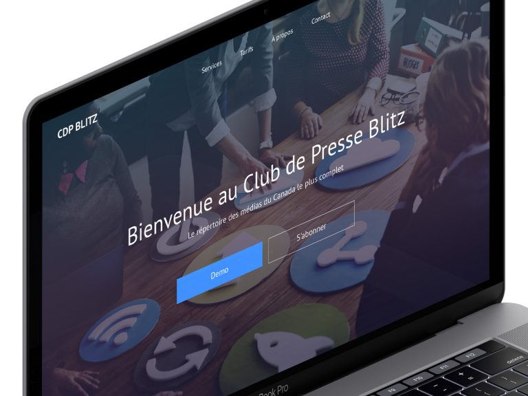
Optimized database & upgraded functionality of media directory hosting over 35K contacts
Justin Alexander
Performed a massive CSM redesign for this leading bridal-dress fashion brand with over 1,500 retail stores globally