Pocket Lists is an iOS and web planning application to get your life in order. Attractive design, easy-to-navigate interface, and a real-life background of making up must-dos lists are behind this app. Simple as that it makes you more organized and progress in everything in your life.
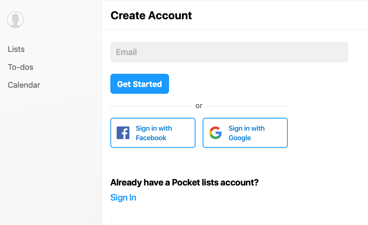
#1. No possibility of quick registration and authorization
UX Bug
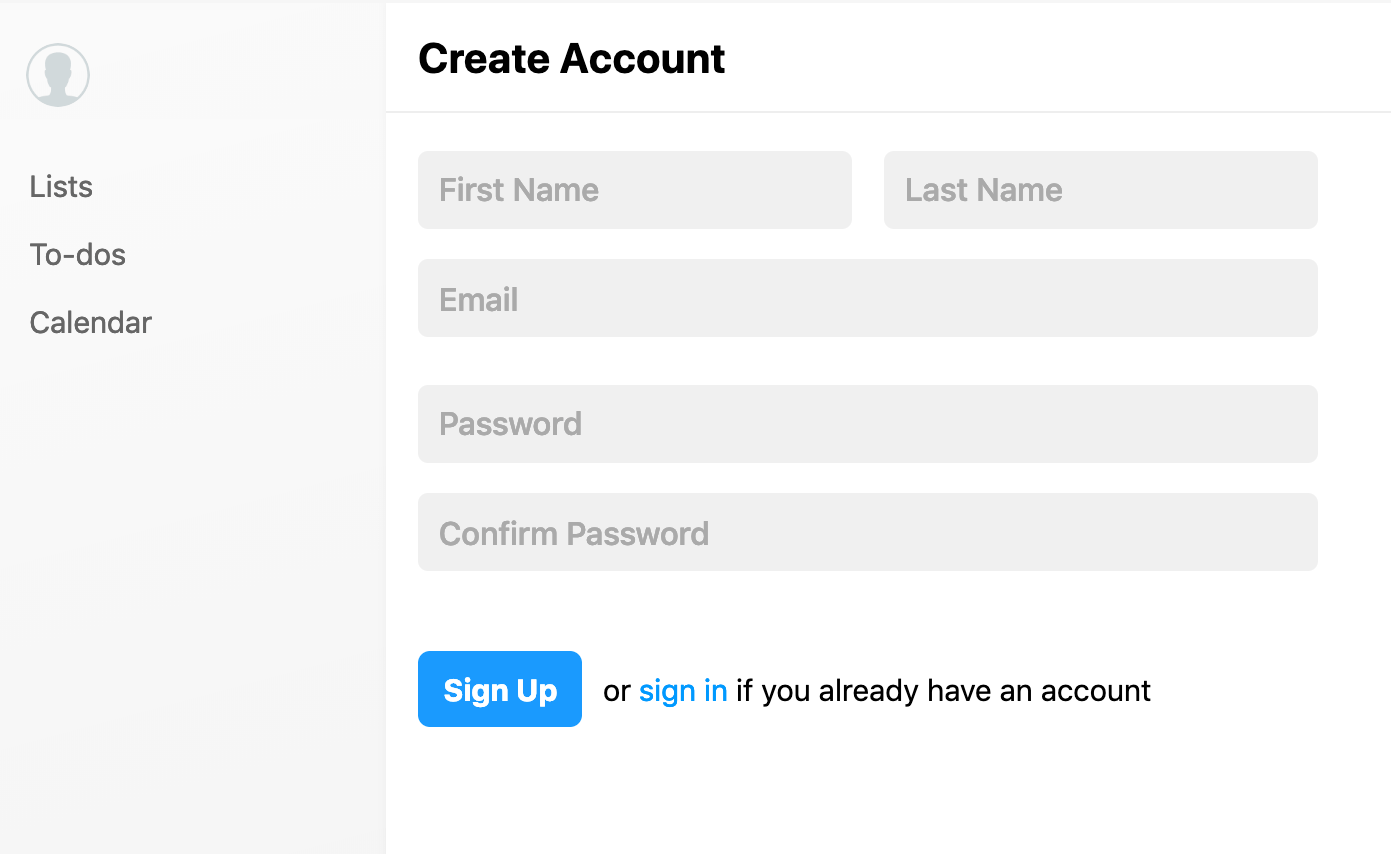
In recent years, entering and registering via social networks for SaaS services makes it much easier for users to get in touch with the product. Logging in via Fb, Twitter would make the registration process and logging in easier and faster.
Current look
Proper look
Severityminor
#2. Duplicate search query
UX Improvement tip
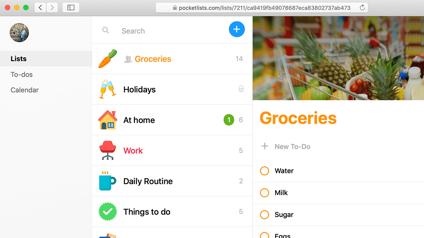
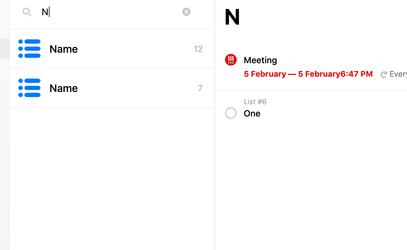
Duplication while typing in the search box. As a result, while searching a word the user focuses on the right-side search results because of the larger size of the letters, although in fact, the desirable search results may appear on the left side.
It is obvious why it was decided to come up with such a decision since this search is universal and searches not only by the names of the lists but also by their content.
This is convenient and it allows you not to discretely duplicate the search feature several times for different entities.
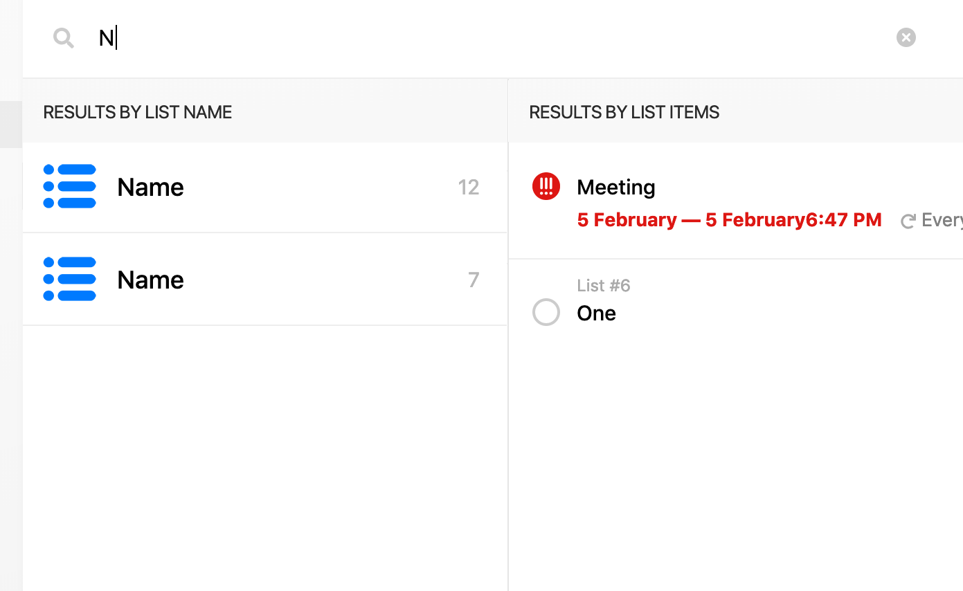
We would suggest expanding the search box for the entire width of the second and third blocks and add two additional plates: “Results by List Name” and “Results by List Items”
Current look
Proper look
Severityminor
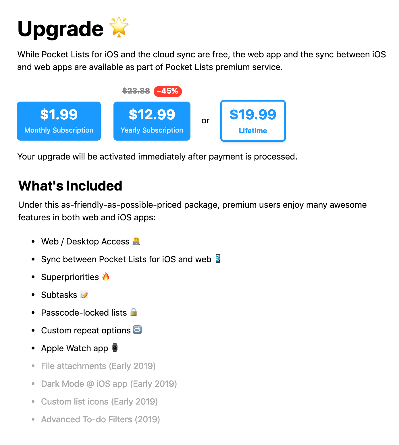
#3. It’s not clear what features a user gets for the Premium pack price
UX Bug
It would be more logical first to show the benefits and then below the list announce the price and the button to buy. At present, the price for what we pay and functions are split by other content.
Current look
Proper look
ProoflinkSeverityminor
https://www.invisionapp.com/inside-design/comprehensive-guide-designing-ux-buttons
#4. Incorrect vertical alignment of icons to the near elements
UI Bug
It’a pity for the user on trying to make action do not receive any reaction back from the interface.
Current look
ProoflinkSeverityminor
https://medium.com/bpxl-craft/10-essential-tips-for-user-interface-icons-e7d04b5988a5
#5. Errors in context menus alignment
UI Bug
The space between the icons and links is concertinaed. In order to improve this context menu, we suggest assigning left-alignment to all links.
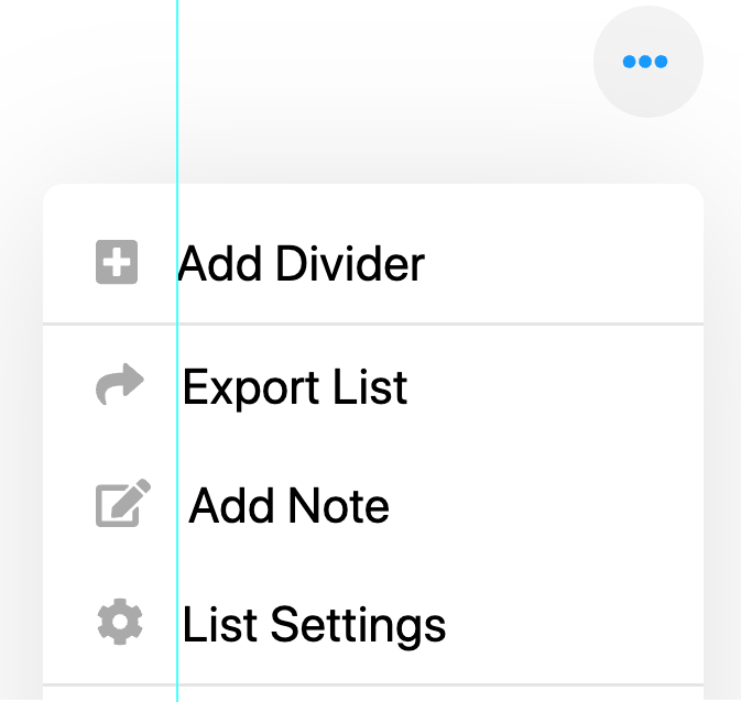
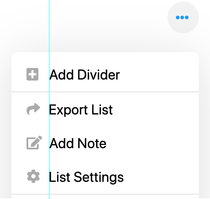
ProoflinkSeverityminor
https://books.google.com.ua/books?id=CJpGDwAAQBAJ&pg=PA180&dq=design+
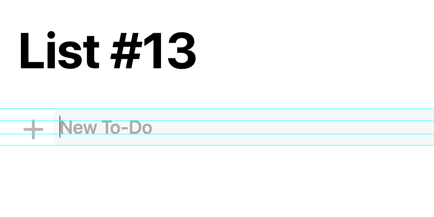
#6. If erase the name of the list and then move aside, there is no way back to editing or deleting of the unnamed list
UX Bug
At some point, it seemed to me that my task list was corrupted, and I would have to make a new account since it was completely impossible to go to the list category to change its name or delete it. Fortunately, this can be fixed by creating a new list category; then going to the list without a name is successful. However, the problem comes across quite often; hence, this decision is not entirely logical.
Current look
Severitymajor
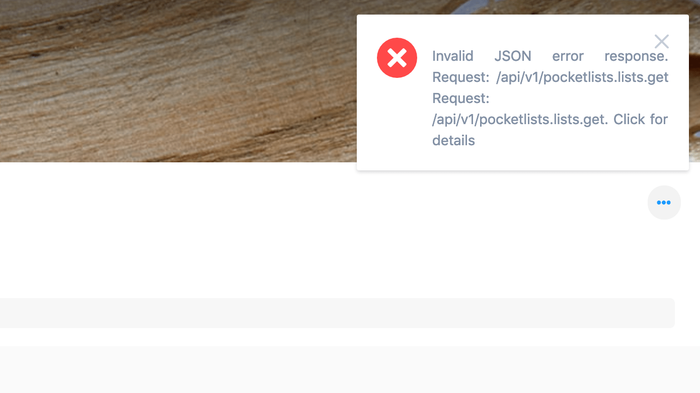
#7. Errors in the service are not clear
UI Bug
Error messages should provide as much info as possible and disclose not only the reason of the error, but the solution as well. In this case, error notification contains no relevant info on what happened. It is not clear what was the error’s impact and how to prevent similar flaws in future.
Current look
ProoflinkSeverityminor
https://www.uxmatters.com/mt/archives/2018/05/how-to-create-good-error-messages.php
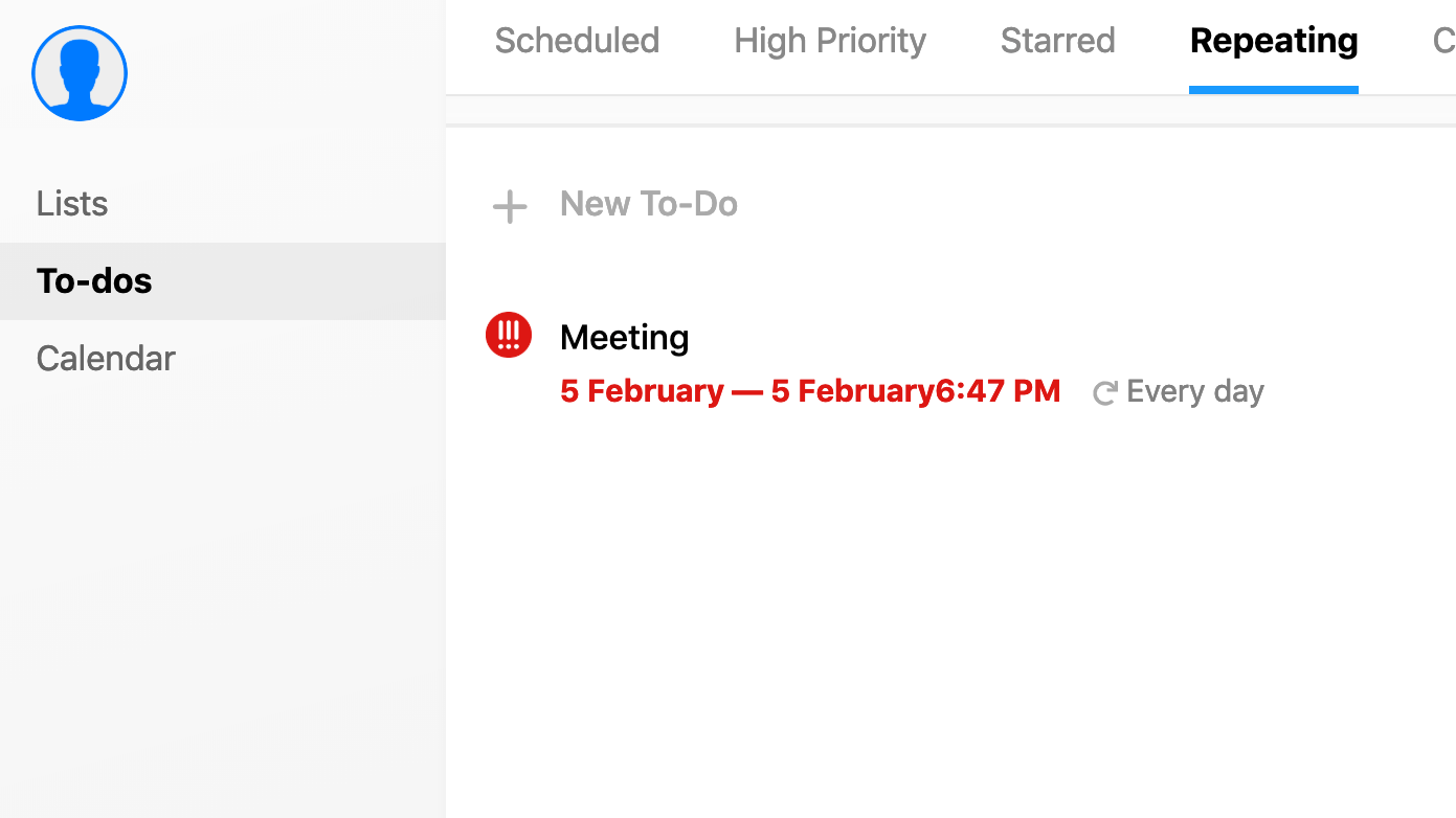
#8. No space between Meeting date and time
UI Bug
After clicking on the Contact link the whole page gets white and only reload helps to solve the issue.
Current look
Severityminor
#9. Accelerate interaction with list items
UI Bug
At present, in order to open the details of a list’s item, you need to click on it once, and then when the overflow menu icon appears click again. In this case, it makes sense to minimize user clicks and make it possible to see the overflow menu icon when you hover over any menu item without additional clicks.
Current look
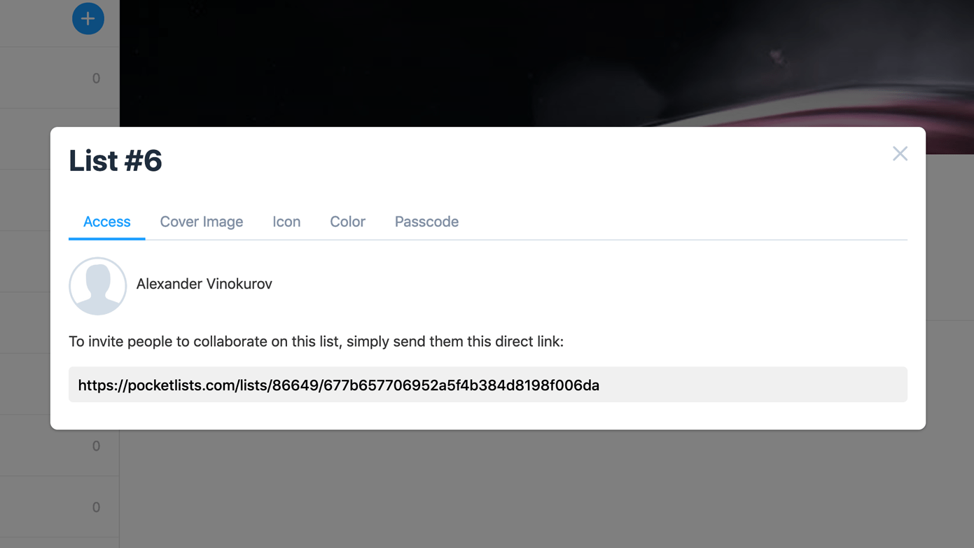
#10. We think a step ahead for the user
UX bug
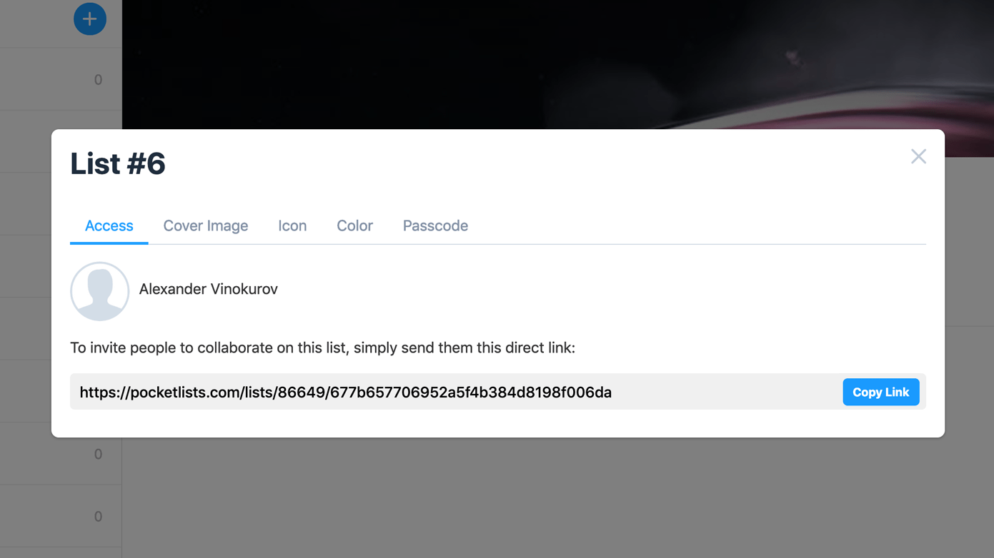
It is enough to add the Copy Link button so that the user does not have to select the link manually and copy it through the right mouse button or keyboard shortcut.
Current look
Proper look
Severityminor
Pocket Lists is one of the best iOS apps to organize your task list. Its usability is ensured by simplistic, smooth and vivid design. Web version is an integral part of this service ecosystem. Unfortunately it has a number of flaws, that can be improved from both UI and UX perspective.

Alexander, Designer
About Redwerk
Redwerk is a team of talented and creative people whose mission is to tailor high-end software solutions for businesses around the globe. Redwerk stands for seamless and smooth outsource web application development for different verticals. We will help to implement iOS app of any complexity for those who require iPhone software development services. Our skilled team will ensure an eye-catching look of your product through our UI/UX design and development services. We have successfully implemented 80+ projects for such remarkable companies as Quandoo, Justin Alexander, Universal Music Group, Hosting.com, WorldNow, which proves our solid expertise and in-the-field knowledge that can be applied to boost your business.




Redwerk team comments